Sunday, August 15, 2010

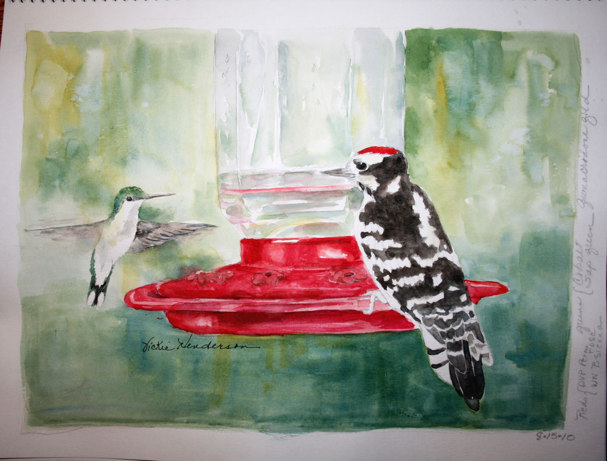
Hummingbird and Downy Woodpecker on Nectar Feeder

If you love nature and you love to recreate what you see and experience in watercolor, there couldn't be anything more fun than diving back into a subject and watching it come to life in a painting.  When it comes to birds, that could also mean tripling and quadrupling your fun!
It has been fun on top of fun to hear and witness this male Downy woodpecker visiting my nectar feeders intended for tiny hummingbirds.  But top it off with interactions between the two species and smiles just keep coming.

Painting this sketch had the same effect.  I smiled a lot.  And when you're smiling there is no worry about outcome.  You're just loving your subject and loving the opportunity to give it center stage.  And there's a number of ways to create that stage, among them, painting light against dark, soft against hard, and color that leads the eye through the painting.  I often approach these elements intuitively
I chose my background colors in this sketch first, focusing on the greens of the trees and the light in the spaces in the unfocused background.  A principle I learned from my long-time watercolor mentor and instructor, Ann K Lindsay--the fewer colors you use, the more unified your painting.   I've found this to be excellent advise that stuck with me and greatly simplifies decisions!
In this sketch my primary colors are DVP Cobalt Blue , WN Quinacridone Gold for my yellow, and DVP Permanent Rose for my red.  (Note: brands with the same color name vary in actual color.  WN stands for Winsor & Newton brand paint, DVP for Da Vinci).  The rest of my colors consisted of two neutrals and sap green, all used to alter the shades of the above three primaries:  DVP Sap Green, to add a little warmth to green made with the gold and blue; WN Van Dyke Brown, used with cobalt to make black; WN Burnt Sienna used with rose to warm it.  I also use burnt sienna with blue to make grays, adding a touch of the other colors on the palette as needed.  
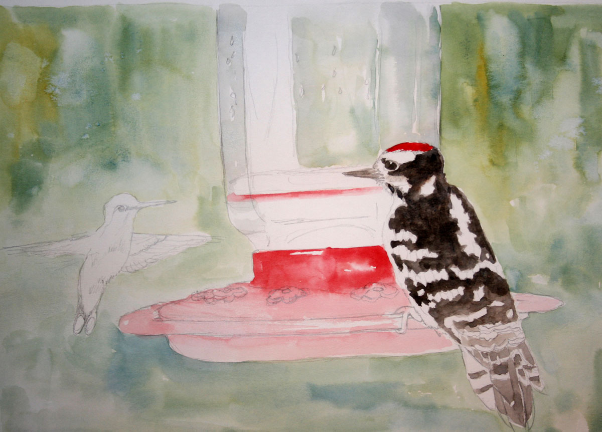
As I'm working on the light washes, I'm making a map of sorts.  I'm aware that my hummer and the water in the feeder will both be the same colors as the background.  This means I have to draw the viewers eye to my subject with the placement of values, that is, the positioning of darks and lights.  At this point (above), I also add color to the nectar container which reflects the background, and to the water in the feeder as a reference for these values.  The water and the feeder represent my lightest lights.

The hummer is next, creating wings that have a fairy-like movement of 40 to 80 beats per second.


To soften edges on the hummer's wing, I laid down paint strokes, rinsed my brush, blotting excess water from the brush with a sponge or paper towel, then brushed along the edge of the paint.  The paint edge is softened by the  moisture from the brush.  The amount of water you leave in the brush controls how far the pigment will spread from the original line.  

One way to suggest hummer wing movement is illustrated below--a combination of disconnected shapes, blurs, a mix of hard and softened lines.
Below is the almost finished sketch, created in one of my favorite sketchbooks made by Aquabee, on 11 x 14 paper.  What made me realize it wasn't quite finished was a glimpse at an LCD image on my camera that highlighted the widely separated gold areas.    
The yellow in this sketch is like an accessory with a special function.  It either helps move the eye through the painting or it distracts, especially since there is no yellow in my two stars.  So, I added yellow to areas where 'my eye wanted to see yellow', moving left to right from one side of the painting to the other, dabs of yellow glaze leading through the two birds.

You may already know how this dictate-from-the-eyes feels.  It's a sensation that is visually uncomfortable, that is, it bothers until the correction is made.  And when it's right, you know it--your eyes are happy again.  See what you think by comparing the finished sketch below to the one above.
In bird-watching, the intuitive ability to identify a bird by its shape and movement is referred to as 'jizz'.  It's a wholistic and instant recognition.  It's learned.  Painting works the same way.  Besides helping you learn the skills of manipulating water and pigment on paper, practice develops jizz, your eye's intuitive ability to know what your painting needs in order to please you.  


Friday, August 6, 2010

The Curious Wood Stork

Below you see a Wood Stork I sketched nine years ago.  In fact, this was both the first time I attempted to record my travel experience in a sketchbook and my first sightings of Wood Storks.  I had to get out my field guide to be certain of the species.  I also didn't have my digital camera back then for reference images, so the sketch was created from my field guide and my memory, giving it a whimsical quality.  
Sketchbooks are tons of fun, both creating them and looking back on them.  They reflect the mood of the moment as much as the subject.  Below is another Wood Stork sketch created this year.  In this encounter, I had the fun surprise of seeing this bird standing close-up, near the road.  When you are observing from a car, birds and animals are often undisturbed and may stay around allowing amazing looks.
My impression of this endangered bird--a bird draped in chiffon-like plumage topped off with a head full of wrinkles and scales.  What a combination.  When I looked at my photo images later, all I could think about was the fun I would have sketching him!  And while I was sketching all those scales and wrinkles on his head, I wondered more and more what this characteristic was all about.
To create this sketch, I experimented with masking fluid to save the feathery edges of the plumage and used a disposable skewer to make the lines.  This avoids soaping a brush to prevent the bristles from sticking together and also solves some of the challenge of making fine lines.  But even with a sharp tipped skewer, the fineness of the line takes some practice.  After dipping the stick in the fluid, droplets form on the tip.  What worked for me was to place the drop of fluid in a large area and drag a finer line of liquid to the edge of the feather.
Since rubbery masking fluids deteriorate with exposure to air and lose their effectiveness over time, I've poured some into an old film canister, to lessen exposure to the original bottle, and labeled it with the type of mask and date.  Have you ever picked up a bottle of mask and wondered how old it is?  At least on this bottle, there was no date anywhere.  Masks are said to have an effective life of approximately one year after they're opened.

This sketch also reinforced the practice of walking away from the table for a while, sometimes overnight, to discover what fresh eyes will see.  In this case I noticed that the placement of the eye didn't look right.  A closer look and I realized the problem was the height of the crown. 

A light scrub and a new crown line and the problem was solved.


Wednesday, July 21, 2010

Sketching a Limpkin in Water

More time please!  A thousand images to paint and so little time.  I could go out in nature every day for the rest of my life and never get enough of it.  And then there's the time needed for painting.  I have enough inspiration right now to keep me busy for months.  
I began this sketch by applying liquid resist to save the reeds and edges of the bird while I added a wash of blue.      
The wash ended up lighter than I wanted, reminding me to make a bigger, juicier puddle of paint next time.  On the other hand, smooth water reflects light and light areas are part of what we see when we look out on water.  When the paint dried, I removed the resist.
Below, I added color to the face and bill. 
When I stepped back from the sketch, I didn't like the brown I had mixed, too dark.  So I dried the paint thoroughly and using a scrub brush, lightened the brown areas.  I then changed the paint mix to a lighter shade of brown, a slightly different mixture of Cobalt blue and Burnt Sienna, with a touch of Van Dyke Brown.
At this point, I shifted focus and spent sometime creating the shading around the larger body feathers.  I applied paint first, then softening the edges.  It's one of those details I enjoy.  It was while working on this less stressful area (meaning I've practiced it more), that I noticed the shadow.  I had completely lost the slender shadow of the head and neck.  Checking to be sure the paint was completely dry before starting, I scrubbed out the right side of the shadow (above).  
Above you see my two most used scrubbers.  The one on the left is about 3/8 in wide and soft, for light scrubbing in larger areas.  The one on the right is made of stiff bristles and works well for tight areas.  The word scrub is a misnomer, really, because the idea is not to scrub the paper, but to lift off the paint.  You want to preserve the paper's surface as much as possible while removing pigment.  The operative word is "lift".  Apply clean water with the scrubber, brush a few strokes with a lifting motion, then blot with tissue or paper towel.  The brush stroke loosens the paint; the blotting lifts it off the paper.    
I added detail to the reeds, corrected the body shadow shape (see top image), and added detail to the rest of the feathers.  To finish, I brightened white areas on the plumage by adding some white gouache.

9 x 12 watercolor on Arches 140# paper.


Saturday, July 10, 2010

A Florida Scrub Jay and the Illusive Nature of Confidence

Sometimes I wonder where my confidence goes.  It's as though it has a mind of its own.  One minute its around to help me move forward, in the next it has vanished and can't be found. Instead I hear a doubting voice.
Natalie Goldberg, author and writing teacher, calls this thinking "monkey mind", a mindless chatter with endless ways of thwarting our efforts.  For me, it is likely to show up when I'm trying something new, when I'm tired, feeling pressured, or when I set out to do something that I haven't practiced for a while.
Fear is the culprit, of course.  And the dialog goes something like, "whatever possessed you to think you could do this?"   It's a critical voice, a fearful voice, and it ultimately warns, don't take this risk, stay in safe territory.  It's also the anxiety that builds while you're still in the void, while you're facing the blank paper.   The inspiration to create requires that you step outside your comfort zone, that you put yourself out there and move forward despite uncertainty.
Confidence requires action.  When I begin a painting, I have some idea of what I want to see happen, but it is not until I start the journey that I can see the path more clearly.  Each decision forms the basis for the next, until the painting begins to reveal itself.  Sometime during the process, anxiety fades, time disappears and I notice that I'm smiling.  
It's one of the delights of watercolor, a medium that is fresh, alive, full of movement and surprises.  I have some control, some idea of what to do, but I won't know the whole of it until the painting is finished.  A bit like life, isn't it?  And despite the anxiety generated, mystery is key to the dance.  When the music starts, when the watercolor moves, you soon forget those nagging doubts and just dance.
As I worked on this painting, I had some concern that my values were going to be too similar throughout and that I might not be able to remedy this.  So I turned my focus to my subject, painting in the detail so I could see the relative lights and darks more clearly.  Two things happened.  Foremost, I fell in love with the bird again and that gave my confidence a boost.  Secondly, once the color values in the bird were established, the foliage values began to fall into place.      

9 x 12" Watercolor on 140# Arches cold press paper


Sunday, June 20, 2010

Seeing a Lantana

Seeing is a big word when it comes to making art.  In fact, seeing is everything.
Seeing your subject, the shapes, the detail, focusing in and capturing what makes it of interest to you in the first place.  And simplifying, focusing out to capture the essence, the larger shapes and values, without becoming distracted by detail.  Both are necessary, a balance that only practice and preference can achieve.
Sketching outdoors is relatively new to me.  I'm more prone to snapping reference photos and painting later through this record and my experience.  But I've seen beautiful work done on the spot.  So I keep giving it a try to see what happens. Because I'm embarking on an exploration and only looking for what new I can discover, I'm finding myself delightfully free of expectations.

I've recently done some practicing on my patio, making a retreat to the cooler in-doors easy when I've had enough of the heat and mosquitoes.  My main goal has been practicing the focus required, learning to filter out distractions and decide just how I want to capture the subject.  Below, you see the end result of my first try to capture my patio pot of Lantanas.
The top photo shows what I completed on the spot.  I sketched without an eraser on this occasion, leaving all the pencil marks, mistakes and otherwise.  Not generally my style.  But I found this okay, even relaxing. The image above is the finished sketch after I added ink and more color.  This is one way to sketch a pot of  Lantanas.  But Lantanas are light, airy.  So this sketch motivated me to try again, see if I could capture more of that lightness in the next sketch.
I created the pencil sketch first, and then began to add color, loose spots of yellow in the area of the blossoms.
Above you see the sketch I finished outside and my working space below.
When I brought the sketch inside, I played with the values, making some areas darker to allow the blossoms to come forward and giving the leaves some variation.  This was nice.  I liked what was happening on the right side of the page.
Above you see the final result, a sketch that expresses something different about what I see in those flowers, a brightness that the first sketch doesn't quite capture.  It's interesting, though, I like both sketches.   But don't they have a very different feel?


Sunday, May 30, 2010

Delights of Spring

I put up a nest box near my patio this year and a pair of Carolina Chickadees settled in.  I was delighted to find six hatched young when I checked the box on May 3rd after being away for a week at the New River Birding and Nature festival in West Virginia.
They were amazingly tiny, piled on top of each other, naked and pink.  But boy, did they change rapidly.  

I was lucky enough to be home sixteen days later when they each took their first flight.  This was a surprise. No fluttering stops and starts on the wing.  After a brief hesitation at the box opening, they just one-by-one took flight, zipping up to an oak's mid-canopy to waiting parents who rewarded with snacks.

Landing, on the other hand, was a different matter.  One fledgling grabbed a thatch of twigs for his landing and ended up upside down.  He looked down and around, as if to say, oops Mom, what now?

Sketch:  watercolor, ink and gouache on 9x6 pastel tonal paper.

Monday, May 24, 2010

The Fun of Painting a Red-winged Blackbird

I think it was the bright neutral reeds that enticed me to paint this blackbird.  The contrasts were brilliant in the early morning light.
Or maybe it was the fun of watching the males display their bright shoulder patches, singing and ruffling their feathers while searching in the shadows to see if the females were impressed.  Even the arrival of a bus load of bird-lovers from WV's New River Birding and Nature Festival did not disturb their early morning nuptial festivities.  This is what I love about bird watching, the moments that bring a bird to life, that give you a glimpse of personality and how they go about their day.  Forever, this is not "just another blackbird" but an impressive Red-winged Blackbird.
I can't explain why I decided to use a light pumpkin, 75# pastel tonal paper for this painting, except that I initially considered using gouache to highlight the reeds.  As it was, the reeds became incidental as the painting progressed.  Instead, I was more attracted to the possibilities of morning light and jumped right into playing with the background, the impressionistic splash and disarray that grasses naturally create.  (The pale pumpkin paper actually has a rosy glow, now that I think about it.)
This is what makes watercolor fun for me, the surprises and movement, its abstract qualities.  It lends itself so well to intuitive thinking, a kind of spontaneity that gets stronger as you become more familiar with the medium.

I don't want to control the paint as I work.  I want to play with it, move with it and enjoy what happens, all the while keeping in mind that I want to also showcase my subject.  Even with the playful start in this painting, I limited my palette.  The fewer colors, the more unified and brilliant the painting.  I chose Winsor Newton's Cobalt blue, WN Quinacridone gold and Daniel Smith's Carmine Red for my primary colors and added WN Burnt Sienna for brown.  All other colors you see are mixes of these four colors.
I painted the bird in layers, not sure just how to handle the black, working it through as I went along.  I wanted to see some shading and color, not just a mass of black.  My reference photo was printed in black and white on my laser printer which offers very little detail.  The practical reason for this--I'm out of one of my color ink cartridges.  Artistically, however, this turned out to be of benefit.  It gave me the freedom to create the background colors from my imagination and memory.  

As I began to add shading to the foreground reeds below, I noticed that I had lost the forward edge of the front wing (see above).  Below, I have scrubbed that edge so I can restore it with another application of paint.    
As I added shading to the foreground reeds, you can see what begins to happen above.  With the exception of the bird, the values are now mostly mid-tones with little variation.  To solve this problem, I added a darker mix of green and gray around some of the reeds to add a depth.  This darker shade also leads the eye around the bird.  
9 x 12" Watercolor on 75# toned Pastel paper.


Ocean Trail at Rancho Palos Verdes Preserve, California--2015

Ocean Trail at Rancho Palos Verdes Preserve, California--2015

Joshua Tree National Forest, California, with son Chad and daughter Thuan--2015

Joshua Tree National Forest, California, with son Chad and daughter Thuan--2015
Photo credit: Thuan Tram

Bird banding with Mark Armstrong at Seven Islands State Birding Park - 2014

Bird banding with Mark Armstrong at Seven Islands State Birding Park - 2014
Photo courtesy of Jody Stone

Birds Close-up

Birds Close-up
Photo courtesy of Karen Wilkenson

Enjoying Gray Jays in Churchill, Manitoba

Enjoying Gray Jays in Churchill, Manitoba
Photo courtesy of Blue Sky Expeditions

A dog sled experience with Blue Sky Expeditions, Churchill, MB--2014

A dog sled experience with Blue Sky Expeditions, Churchill, MB--2014
Photo courtesy of Blue Sky Expeditions

Churchill, Manitoba--2014

Churchill, Manitoba--2014
Photo courtesy of Blue Sky

2014 Hummingbird Festival

2014 Hummingbird Festival
Photo courtesy of Jody Stone

Smithsonian National Zoo with one of my Whooping Crane art banners and son, John--2014

Smithsonian National Zoo with one of my Whooping Crane art banners and son, John--2014

Muir Woods on the Dipsea Trail at Stinson Beach, California--2014

Muir Woods on the Dipsea Trail at Stinson Beach, California--2014
Photo courtesy of Wendy Pitts Reeves

Checking out the gulls at Stinson Beach--2014

Checking out the gulls at Stinson Beach--2014
Photo courtesy of Wendy Pitts Reeves

Discovery Hike in Denali National Park and Preserve, Alaska--2012

Discovery Hike in Denali National Park and Preserve, Alaska--2012
Photo courtesy of Ruth Carter
Related Posts with Thumbnails