Sometimes art work gets finished in an orderly fashion. You move through the work from start to finish in a steady progression. At other times, the project gets set aside for many different reasons, mostly a shortage of time, interruptions, something else inspiring happens, or an indecision may stall the finish.
In the case of this owl, it was a persistent indecision about those eyes. When you wake a sleeping screech owl, they don't have a very happy expression on their face. This owl was roosting in a screech owl nest box, sleeping as owls do during the day in late November of 2009. The opportunity to see him up close was so special. There was only time for some quick reference photos, and the one I used for this sketch page was taken in overcast conditions. No light reflected in those eyes, making that beautiful face even more menacing than it naturally would be under these circumstances. So when I initially painted the sketch page, I painted the dark pupils reflecting no light, as in the photo. As you can see, this does not result in an appealing expression. Light brings life into our wildlife sketches.
I was surprised when I saw how long ago I first created this sketch. I had finished the right side of the face, leaving the left unfinished and the dark eyes scrubbed out. Yesterday, when I came across this unfinished sketch, I was again struck by the beauty of this magnificent little bird, our only small eastern owl with ear tufts (feathers). Screech owls are only about 7-10" in height and are both predators (omnivores) and prey for larger owls and hawks.
While visiting this sketchbook, I looked at more pages. Many were finished, giving me a feeling of deep satisfaction and pleasant memories of the moments they captured. Others were left blank with a note about what I wanted to paint in that space, and still others had a pencil sketch. Any of your sketchbooks look like this?
Above, you see a delightful moment in a cold November rain when a tufted titmouse was singing his heart out just beyond my patio in the midst of red holly berries. I look forward to finishing this page soon.
Owls are among the most beautiful of birds, with very intricate feathering patterns around their face forming the facial disk that is characteristic of all owls. The facial disk is composed of stiff, lacy feathers that serve to direct air flow and aid vision and hearing. But beyond function these feathers are exquisitely beautiful! The feather tufts that we often call "ears" help camouflage the owl while it sleeps during the day.
Eastern screech owls come in two colors, the rufous or red phase you see here and a gray phase.
Tuesday, August 30, 2011
Saturday, August 27, 2011
Coneflowers--Wet-in-Wet and the Colors of White
Though it is late in the growing season, I had the urge to plant flowers this past week. It could have been because I ran across some of my favorite perennials that I couldn't find earlier in the season--coreopsis and coneflowers.
Besides the insects and birds that flowers attract, they are beautiful and fun to paint! Yesterday, I enjoyed an opportunity to sit near these garden additions and create coneflowers in my sketchbook using brush and paint without the detail of drawing. Coneflowers have a distinctive shape with daisy-like petals that loosely droop. How deeply the petals droop depends on the stage of the flower's maturity. This characteristic makes them good subjects for loose painting. By that, I mean watery painting with less concern about detail.
Besides planting purple coneflowers, I also planted a white coneflower variety. The white in flowers is particularly fun to paint. "White" in a watercolor painting is the lightest color/value in your painting. Since white flower petals generally reflect the colors around them, they offer a fun opportunity to play with wet-in-wet painting, letting the colors blend on the paper and a brush stroke of clean water carry pale pigment into petal shapes. I'll show you what I mean.
Below, you see how I created the watery flower images you see on the right hand side of the sketchbook at the top of this post. If you would like to give this way of creating coneflowers a try, use one of the images above, or a flower from your own garden or collection of images as a guide. If you already have experience with this type of painting, this exercise makes a fun and relaxing practice.
On dry paper, paint a coneflower head shape, as shown below. I used WN Quinacridone gold.
Have two containers of water handy, one to rinse your brush between colors, the other to load your brush with clean water. Brush clean water along the edge of the painted area and bring it down to form the shape of the flower head, as shown below. Leaving white areas is one way to add interest and give the impression of light reflection. Learning how much water your brush holds and how much you need to use comes with practice.
While this area is still wet, drop in some cerulean blue (or another blue of your choice) along the bottom edge.
Rinse your brush and load it with clean water. Touching the edge of the bottom of the cone shape, paint a petal shape with clear water coming down from the cone center. Pigment will flow into the water left by the brush stroke. Tilt your paper if needed to aid this movement.
Continue to create petal shapes with brush strokes of water. I enjoy the surprise of this technique and the richness of the color that is created when pigment is dropped into pigment. The cerulean blue and quinacridone gold blend to create a nice green like the underlying color seen at the base of the yellow and orange blossoms of the coneflower head.
Try a series of these studies and enjoy seeing a variety of interpretations of these lovely flowers. Try adding a stem and a leaf. And if you try this exercise and post your results on your blog, send me a link. If you would like, I can post the link here. If you don't have your own blog, and would like to share your results here, send an image to me at: viclcsw (at) aol (dot) com. Below, you see more of my studies.
I've used a scrap sheet of watercolor paper (with a rejected painting on the other side) and divided it with artist tape to create six separate painting areas for these studies.
Coneflowers are part of the aster (asteraceae) family, along with sunflowers and, like sunflowers, have a flower head with many tiny blossoms. This is clearly one of my favorite flower families!
Besides the insects and birds that flowers attract, they are beautiful and fun to paint! Yesterday, I enjoyed an opportunity to sit near these garden additions and create coneflowers in my sketchbook using brush and paint without the detail of drawing. Coneflowers have a distinctive shape with daisy-like petals that loosely droop. How deeply the petals droop depends on the stage of the flower's maturity. This characteristic makes them good subjects for loose painting. By that, I mean watery painting with less concern about detail.
Besides planting purple coneflowers, I also planted a white coneflower variety. The white in flowers is particularly fun to paint. "White" in a watercolor painting is the lightest color/value in your painting. Since white flower petals generally reflect the colors around them, they offer a fun opportunity to play with wet-in-wet painting, letting the colors blend on the paper and a brush stroke of clean water carry pale pigment into petal shapes. I'll show you what I mean.
Below, you see how I created the watery flower images you see on the right hand side of the sketchbook at the top of this post. If you would like to give this way of creating coneflowers a try, use one of the images above, or a flower from your own garden or collection of images as a guide. If you already have experience with this type of painting, this exercise makes a fun and relaxing practice.
On dry paper, paint a coneflower head shape, as shown below. I used WN Quinacridone gold.
Have two containers of water handy, one to rinse your brush between colors, the other to load your brush with clean water. Brush clean water along the edge of the painted area and bring it down to form the shape of the flower head, as shown below. Leaving white areas is one way to add interest and give the impression of light reflection. Learning how much water your brush holds and how much you need to use comes with practice.
While this area is still wet, drop in some cerulean blue (or another blue of your choice) along the bottom edge.
Rinse your brush and load it with clean water. Touching the edge of the bottom of the cone shape, paint a petal shape with clear water coming down from the cone center. Pigment will flow into the water left by the brush stroke. Tilt your paper if needed to aid this movement.
Continue to create petal shapes with brush strokes of water. I enjoy the surprise of this technique and the richness of the color that is created when pigment is dropped into pigment. The cerulean blue and quinacridone gold blend to create a nice green like the underlying color seen at the base of the yellow and orange blossoms of the coneflower head.
In the next study, I dropped in WN French ultramarine blue and a touch of Daniel Smith Alizarin Crimson along the bottom edge.
Below, you see the variation that resulted.Try a series of these studies and enjoy seeing a variety of interpretations of these lovely flowers. Try adding a stem and a leaf. And if you try this exercise and post your results on your blog, send me a link. If you would like, I can post the link here. If you don't have your own blog, and would like to share your results here, send an image to me at: viclcsw (at) aol (dot) com. Below, you see more of my studies.
I've used a scrap sheet of watercolor paper (with a rejected painting on the other side) and divided it with artist tape to create six separate painting areas for these studies.
Coneflowers are part of the aster (asteraceae) family, along with sunflowers and, like sunflowers, have a flower head with many tiny blossoms. This is clearly one of my favorite flower families!
Friday, August 19, 2011
Sunflower Study
I have always enjoyed sunflowers. They have so much character.
Fresh, lively, tall and strong, sunflowers are full of energy rich seeds for birds and other wildlife. And I love the artsy, withered petals that remain as the seed heads mature. Their twisted shapes are intriguing, and full of subtle colors--maroon, violet, gold, burnt sienna, yellow ochra, thin veils of purple, and deeper shades of purple in the shadows. After enjoying a stroll through a sunflower field at Seven Islands Wildlife Refuge, a favorite natural area near my east Tennessee home, I have a collection of images of sunflowers of all sizes, shapes and maturity levels, giving me plenty of inspiration and reference for painting.
Flowers are perfect subjects for practice and for playing around with different ways to interpret color and light in watercolor. Above you see that I taped the paper to a backboard and set it on a table easel. I also printed both a color and a black and white image of the subject. The black and white image often allows you to see the values more clearly and encourages the use of your imagination in defining areas of light.
To create the background, I wet the paper with brush strokes of clear water, and brushed on a wash of Winsor Newton New gamboge, Arylide yellow and Cerulean blue. As I worked, I allowed these colors to blend naturally as they moved on the paper. After this initial wash dried completely, I added color to the sunflower,working around the petals and the leaves, letting colors blend wet in wet.
I added color to the butterfly early in the painting so I could see how it looked with the background and all that rich sunflower yellow. When I saw the butterfly on the sunflower in the field, I thought its pale under wings would not show up well enough to create a nice center of interest in a painting. But, I was pleasantly surprised as the butterfly began to take shape in this study.
Above you see I have lightly scrubbed the outer edge of the butterfly's wing to allow it to blend more with the background. I have also lightened the area along the top of the butterfly's wing and the tip to give the impression of light.
What we generally refer to as the bloom on a sunflower is really a large inflorescence or sunflower head that contains 1,000 to 2,000 individual flowers joined together at a receptacle base.
Links and resources:
Posts with paintings of butterflies and flowers, the most recent post will be first.
Labels:
butterflies and flowers,
painting light,
scrubbing,
sunflowers
Monday, August 15, 2011
Forever A Student
I think I will forever be a student. I love to learn, explore, venture past the edge of what I know, into the fresh and new. It's exhilerating. It expands my world and brings me joy and laughter.
This is how I feel about watercolor, creating gourd art, about watching and learning about birds and other favorite nature subjects, and about life. Creativity comes from a deep place and it can be tapped by many different activities. Eventually, they all come together in a compelling desire to create. I want to have plenty of choices at my finger tips when I make art and write, choices available from my mental library, so I can snatch anyone of them and use them at the moment I feel inspired.
This is what makes practice so valuable. Practice is play time, an unfettered chance to explore, exercise curiosity, try something new without knowing how it will turn out. The benefits? Using current skills and pushing beyond them, feeling your way through a decision, tapping your senses for help, using your intuitive abilities, and opening up to greet whatever you learn--all of these get exercised when you try something new! This is great for the soul, great for building courage, and great for having fun! When the results are disappointing, you gain a sense of what to do differently (the value of mistakes), and when something turns out beautifully, it's exhilarating. You expand your wings and your world enlarges.
Below, you see the point at which I was thinking this is a mess! When I started adding shape and shading to the shell, I ran into new challenges. But I kept going and used more contrast. Scroll to the top again to see the finished study.
I initially worked without sketching, a big challenge for me. I love to draw. But it is also clear to me that when I sketch, I naturally limit myself by trying to "obey" the lines. It's like coloring inside the lines as a child and loosing your expressive freedom. Watercolor doesn't like to behave that way. It likes to move. Learning about that movement and keeping it in mind as you go is a great way to get to know the medium. It's also a great way to learn more about yourself. How do you work your way through obstacles?
"Painting the light" that is reflected on and around a subject is a great exercise to challenge your ability to see light and to express it on paper. As I was painting this shell I thought of many other ways I could approach the subject and the light.
Links and Resources:
Visit my review of Colour and Light on this blog.
Thursday, July 28, 2011
Purple Martin with Prey--The Finish
Purple martins are secondary cavity nesters, birds that rely on other birds to make the cavity for their nests. But in the course of history, both natural nesting cavities diminished and humans began furnishing nesting cavities. Just how long ago humans began providing cavities is not certain, but some believe that Native Americans began this tradition. People loved the birds, and the birds learned that fewer predators were found around humans. Martins in the eastern United States now rely exclusively on human furnished cavities for nesting.
These clusters of white gourd-shaped cavities that dot our rural landscapes, are now as much a part of the purple martin ecology, as the flying insects they capture on the wing.In the above image, you see both the under-painting of rose and gold that I've initially applied to the martin and the additional colors I'm adding as I apply glazes. The martin's color will change with each application of thin veils of color. My eyes see blackish wings with a bluer sheen on the body feathers. To create this distinction in color, I add burnt sienna to French ultramarine, giving the wings a more neutral and darker hue than the body. While applying additional glazes to one area of the bird at a time, I let my eye lead me. My goal is a darker martin with color showing through giving the impression of light reflecting off the feathers.
In order to make the background trees recede, I darken them with several more glazes of French ultramarine. Below, I have added sketched detail to the martin gourds and the background trees.
These are the marks that guide my negative painting, the painting of the space between and under the trees, giving more shadow and depth.
Leaving the painting for a while to allow the paint to dry, I returned to discover that my tree trunks looked rather puny. They are behind the martin housing pole, but they should not appear so slender as they are depicted in the above image. It's one of those moments when you say, "good grief". But, these corrections happen all the time. When you are painting, you are close to the work and proportions have a different appearance. Stepping back and stepping away are both a very important part of checking the overall appearance of what's happening on the paper. Perspective changes when you are taking in a larger, more distant view. Below, I begin to correct these shapes by lightly lifting color with my scrub brush, expanding and varying the trunk shapes.
Below you see how the trunks appear after adding some color and shading. I have added depth and variation to the tree tops in the same way. Additionally, separate glazes of rose and gold, give the impression of the sun's glow on the horizon. I've added a hint of these colors to the white gourds and the wing tip, as well.
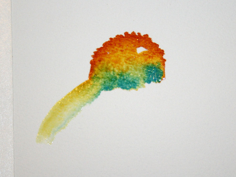
Below, I begin to play with the dragonfly. I love color and adding the orange (burnt sienna and quinacrodone gold) was a special moment of fun. Orange and blue are opposites on the color wheel, and you can see how the two colors sparkle when placed next to each other. I don't leave the colors this bright, both for realistic reasons and because I don't want the dragonfly to compete with the martin. It is included as a dynamic part of the subject, giving the viewer information about the bird and its behavior.
The finishing work included the addition of more glazes and color to darken the martin and add shadow. For this you get to use your imagination! I got so focused on the painting toward the end, that I forgot to take images! Below, you see the finished work.
I am excited that "Purple Martin with Prey" will be on display at the Purple Martin Association's convention in Erie, PA, August 11, 12 and 13th, and will be available for purchase at the fund-raising auction! A special thank you to Graig Kern, for this opportunity.
11 x 14 inch watercolor on Arches 140# cold press paper. Palette: WN Ultramarine Blue, WN Burnt Sienna, WN Quinacridone Gold, WN New Gamboge, WN Permanent Rose, a touch of WN Cerulean.
Links and Resources:
To see all my posts on this purple martin painting project, visit: purple martins.
Click the links to learn more about negative painting and scrubbing.
Monday, July 25, 2011
Purple Martins--The Painting
Purple Martin with Prey--a fun and challenging painting.
Martins are insectivores, averaging speeds of 17-27 mph as they capture insects in flight. Despite hours of observation, I was never invited along on one of those flights to see what the world looks like from up there! So, when I selected this painting composition, I knew everything in the painting would be created from a combination of observations and my imagination.
When the weather is clear, early morning skies are a clear wash of light,

Flat washes are made with even overlapping strokes of color across a tilted page. The paint then flows smoothly downward as it is drying.
To save the whites I applied Winsor Newton masking fluid using a wooden skewer in larger areas, and a straightened paper clip for the thin lines of the dragonfly's wings. The masking fluid adheres to these tools and can be dropped and dragged along the line on the page. While using the paperclip, more care is required to avoid scratching the paper.
Below, you see the sky wash after it is applied. The trees were added before the wash was completely dry.
The paint must be allowed to dry completely before the mask is removed. No assistance from a dryer to hurry things up in this case. Heat causes the rubbery substance in the masking fluid to deteriorate and fuse with the paper, making removal problematic.
The mask bottle instructions suggest using an eraser to remove the masking fluid and this works. However, if the mask is applied generously, it forms a nice rubbery surface that can be removed by applying pressure with your finger tip. In the image below, you see I am rolling it off easily.
Below, you see the white surface that was saved with the masking fluid.
Masking fluid leaves hard edges which sometimes need to be softened. The background martin gourds need soft edges to help them recede into the background. I used my small scrubber, clean water and a blotting tissue, to soften the edges of each gourd to make them look rounder and softer in the low morning light.
Once I lay in the background wash, I am ready to bring the bird to life with paint. This is my preferred way of painting--to work on the subject early in the painting. I want the color and values of the subject to lead my eye as I enrich the background with shading and detail. Below, you see the first glaze that I applied to the martin, discussed in the previous post. 
Next: glazes of color and the finishing details.
Links and Resources:
To see all my posts on this purple martin painting project, visit: purple martins. The most recent post will be first. You may also enjoy my reports on my visits to the martin colony at Vickie Henderson Art.
Click the links to learn more about using masking fluid and softening edges.
To learn more about purple martins visit the Purple Martin Conservation Society
Saturday, July 23, 2011
Purple Martins--Painting the Iridescent Sheen in Black
Purple martins are full of personality. I can't tell you how many times I found myself giggling as I watched these birds interact. The more you get to know a bird through observation, the more invested you become in creating a good likeness of all that you've witnessed.
Besides the busy social interaction and high speed flight of these birds presenting challenges to an observing artist, the male purple martin is essentially black, making color another fun challenge. The translucence of watercolor and the iridescence found in many bird feathers are a perfect compliment. Purple martins are described in Peterson's field guide as blue-black. Their feathers often flash iridescent blue in the sun's light. Even when a bird is black, the reflection of color in light gives the artist many options for capturing the subject.
Glazing and under-painting are one way to do this and the methods I chose for this painting. The translucence of many watercolor pigments allow a color painted underneath to glow through. Above you see my experiments using Winsor Newton Permanent Rose, WN Quinacridone Gold, and a combination of the two to see how they appear through blue glazes--WN French Ultramarine, WN Cerulean and Daniel Smith Carbazole Violet. I selected French ultramarine (at the top of the page) because of its brilliance and clarity.
What I'm going for is not only the blue in the bird but the reflection of early morning color and softness as light reflects off the feathers. Above and below, you see how the under-painting, appears initially. Color is then added by glazing, applying a thin later of paint that allows the color underneath to come through. Each layer of paint is then allowed to dry before applying the next layer.
Now that I've shown you how I approached the bird's color, in the next post, I'll show you the finished painting and take you back to the beginning: creating the initial wash and background.
To see earlier posts on this purple martin painting project, visit: purple martins. The most recent post will be first.
Subscribe to:
Posts (Atom)
Ocean Trail at Rancho Palos Verdes Preserve, California--2015

Joshua Tree National Forest, California, with son Chad and daughter Thuan--2015

Photo credit: Thuan Tram
Bird banding with Mark Armstrong at Seven Islands State Birding Park - 2014

Photo courtesy of Jody Stone
Birds Close-up

Photo courtesy of Karen Wilkenson
Enjoying Gray Jays in Churchill, Manitoba

Photo courtesy of Blue Sky Expeditions
A dog sled experience with Blue Sky Expeditions, Churchill, MB--2014

Photo courtesy of Blue Sky Expeditions
Churchill, Manitoba--2014

Photo courtesy of Blue Sky
2014 Hummingbird Festival

Photo courtesy of Jody Stone
Smithsonian National Zoo with one of my Whooping Crane art banners and son, John--2014

Muir Woods on the Dipsea Trail at Stinson Beach, California--2014

Photo courtesy of Wendy Pitts Reeves
Checking out the gulls at Stinson Beach--2014

Photo courtesy of Wendy Pitts Reeves
Discovery Hike in Denali National Park and Preserve, Alaska--2012

Photo courtesy of Ruth Carter