Saturday, November 2, 2013

Fun with Fall Leaves--Enjoying Movement and Surprise

Leaves are small food factories that use cholorophyll to help produce energy through photosynthesis, a process of converting sunlight into sugars and starches.  During the hot days of mid-august, trees perceive the tiniest changes in their environment, such as the day length, light quality and temperature.
As autumn approaches, chlorophyll in the leaves is broken down into nitrogen, sugars and starches and moved to storage cells in the twigs in preparation for winter.  As the amount of chlorophyll in the leaves decreases, the more brilliant fall colors appear.
When I looked at these sassafras leaves a few days ago, they were mostly green.  In fact, I had trouble finding any leaves at all that were showing red, orange or gold.  Our nights (in east Tennessee) had not been cold enough.  But a couple of nights of near freezing and below freezing temperatures and brilliant colors began to pop out everywhere.  
I taped my Arches 140 lb watercolor paper to a backboard and started this leaf painting by wetting the paper while flat, then setting the backboard on an easel so that the painting surface was nearly upright.  (To see the easel I'm using click here.) As excess water ran down the paper onto the tape, I wiped it with a paper towel.  I waited until the wet shine on the paper became dull before beginning to paint.  The shine means the water is still on the surface and will dilute the pigment too much.

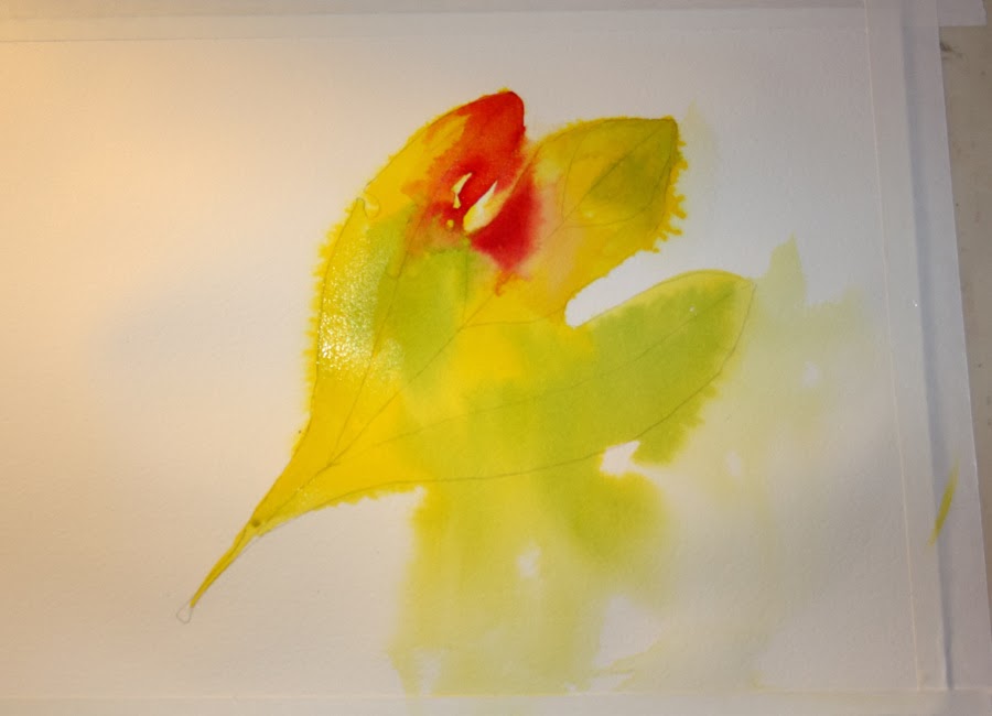
When I mixed the yellow paint to begin the leaf, I used more pigment and less water, so the color moved downward slowly.
I decided it was moving too slowly, not quite enough water, so I squirted some water on the lower edge of the leaf so the paint would move more (above). The fun of this approach to painting is that all the drips, runs, water marks and surprises encourage exploration to see what happens.  This is both a way to paint and a good practice for loosening up and learning about watercolor movement.

Movement is one of the most appealing aspects of watercolor and part of its mystery. You make a decision, watch what happens, and then make your next decision--one decision at a time.  With time and practice, you can anticipate and direct more of what will happen, but surprises will always be a part of watercolor magic.
I added red to parts of the leaf, and again used less water and more pigment in my paint mix.  I didn't want the red to move very far.  I then lifted the painting off the easel and holding it in my hand at less of an angle, brushed some water into the red to lighten it, allowing some of the color to run past the edge of the leaf sketch, as shown below, in the upper left.
At this point, I waited for the painting to dry some.  I want to add paint to the background next.
I use WN phthalo blue to create a background, the same blue that was used to add the green to the leaf color. Using the same blue helps to unify the colors in the painting.   The blue blends with some of the yellow underneath that is not completely dry and makes a nice varigated wash.  Knowing how much paint and how much water to mix comes with practice.
I wanted the background paint to run a little more so I sprayed the area with water and let it flow downward. I am using an old hair spray bottle that creates a fine mist.
I then added more pigment to make the background darker.  I love this affect.  It is fun to watch the colors fuse and run.  You can lighten with water or darken by adding another stroke of paint.  My painting surface is still vertical as I apply the paint.  If I lay the painting flat at this point the paint will flow backward creating water marks or blooms.  Try an experiment with one of your practices and watch this happen.  Blooms can add texture and interest to a painting and there will be times when you will want to use them.
As the water moves down the paper, I wipe the puddles away with a paper towel along the edge of the tape. My easel has a tray but I don't want water to collect there and drip onto the table making a mess that I might forget about.  At this point I let the paint dry slightly, leaving the painting in this position, until the paint has dried enough to stop moving.
I want to add some color around other areas of the leaf so I turn the painting to direct the paint flow and add a light background around the edge of the center lobe of the leaf on the right.  The paper is damp and I only add a small amount of paint to add a hint of color.  I wait for this to dry a bit.

Below, I have turned the painting again, so that it is upside down, and add paint to the right side which will be the left side when the painting is rightside up.

I add more paint to the lower edge of the leaf and fill in the little cut-out.  I then spray some water (below) to help the paint move to soften the edges.  I try not to hit the yellow area with the spray but it will be okay if I do.
I let the paint dry some with the painting still on the easel and then turn the painting right side up to see what I have.  I like this atmospheric movement in the background. What do you think?  You can see some small white spots in the upper left area where the mist landed on the pigment and moved it.
As you paint, you can turn the painting in different directions as it sits on the easel, or change the angle by holding the painting in your hand, or lay the painting flat or with only a slight tilt for the entire process.  There are many choices for approaching watercolor.  The angle of the painting surface influences the paint movement.  The more you learn about how water and paint move, the more at ease you will feel with watercolor.
While painting the large areas, I used a #10 round brush.  I have selected two other brushes (shown above) to use while working on the detail--my #3 round brush (left) and my #2 rigger.  The rigger is the best brush for making thin lines, such as grasses, twigs on trees, or the veins of a leaf! If you haven't used a rigger before, fill a page in your sketchbook with practice brush strokes using your rigger.  This helps to give you the feel of handling the brush and see the magic created by its long bristles.
I have used the elements of several of my leaves combined to create this leaf painting. To finish, I settle on one of them to use as my guide for creating some of the final detail on the leaf.

The veins on these sassafras leaves were much more apparent once the leaf turned yellow and it was interesting to see how the red broke through.  Sometimes an entire section between veins turned red, sometimes a fuzzy red smudge appeared.   I noticed all these details while studying the leaves because I wanted to paint them!  
You can add as much detail or as little as you want.  Above, you can see how I finished my leaf, adding brown spots and veins.

If you have tried some of the "Fun with Fall Leaves" paintings, send me a note about your experience, an image or a link to your blog post at:  vickiehenderson13 (at) gmail (dot) com. Use symbols in the email address.  It will be fun to see other styles and explorations of fall leaves in watercolor!

Next:  Layering leaves

Fun with Fall Leaves series
Why Leaves Change Color
Winsor Newton Watercolors

Tuesday, October 29, 2013

Fun with Fall Leaves--Wet-in-Wet on Dry Paper

More fall leaves!  In this post, I am showing a different approach to creating a leaf painting without wetting the paper first (to see the first demonstration click here).  I begin painting on dry paper and use the wet pigment to carry the color and moisture.  
Where ever I stop the edge is wet.  I can continue that edge either by applying a brush stroke of water or by adding a brush stroke of a different pigment.  Where water is used, the paint will flow into the water diluting the color to give a lighter range of that color.  This provides highlights and variation.
If I brush another color along that edge, the colors will flow together at that point and give a blended appearance where they mix.  Red and yellow become orange.  Green and yellow become yellow-green, and so on.  Letting wet paint flow into wet paint creates brilliant colors as two primaries (red, yellow or blue) mix to form secondary colors.  In this painting, I am using Da Vinci arylide yellow, WN phthalo blue, WN alizarin crimson, and WN Burnt Sienna.
Below I have looked at my leaf for reference and decided to drop some green into that yellow area on the right (above) to create more yellow-green for that part of the leaf.
Compare the leaf below with the one above.  You can see how the green spread into the wet yellow paint and produced that nice section of green with yellow highlights.  I also added some burnt sienna around the edges.
As I looked at the painting above, I decided I wanted to see some red in that light middle section, so I wet it lightly with my brush.  Then I picked up some Alizarin Crimson in my brush and added it.
 This gave the pale area a hint of red in the middle and brightened it.
Next, I mixed some sepia with burnt sienna to add a dark leaf edge and some dark spots to the leaf.  To do this, I created a very wet mixture, loaded it into the brush, and tapped the brush with my finger to make some splatter on the leaf.
Try painting several different leaves or use the same leaf and paint it several different ways!  There are endless possibilities for enjoying leaves in watercolor!

Next:  Enjoying color movement

Saturday, October 26, 2013

Fun with Fall Leaves

There is nothing like the palette that autumn brings to our senses, as leaves turn from shades of green to a wide array of yellows, gold, orange and red.
This spectacular display is due to the interplay of pigments found in leaves.  As temperatures drop, trees stop producing chlorophyll, the pigment responsible for the green color of leaves.  This enables the other color pigments to shine through.
Autumn leaves are varigated in color as this change takes place and that makes it fun to paint them!   Go for a walk and notice the leaves and how they are changing.  Ours have just started to change in east Tennessee because we've just had our first few near freezing nights.  Pick up a few leaves as you walk and bring them inside and let's paint!
Select a leaf and either trace around the edges with your pencil or draw it on a piece of watercolor paper.
Mix up juicy puddles of the colors that you see in your leaf.  In the leaf I selected, I see green, red and rust. To make my green, I mix up a generous puddle of DaVinci arylide yellow and another puddle of WN phthalo blue near it to mix my green.  The other colors are WN Alizarin Crimson and WN Burnt Sienna for my red and rust.
There are many ways to paint a leaf.  In this post, I show you one way.

I wet the surface of my leaf sketch with water and paint it with my lightest color--in my case it is green-- leaving some areas unpainted.  Since leaves are varied in how their pigments change in the fall, I am only using the leaf I found as a reference for ideas and am not concerned with the final result looking exactly the same as the leaf.
Next, I drop some red and rust into the tips of the leaf, letting the two colors blend as I do this.  The damp surface of the leaf carries the pigment into other areas also.
When the surface of the paper becomes too dry, I rinse my brush and re-wet the surface again with clear water so that the water can carry the pigment beyond where I am painting.  As the wet pigment overlaps the dried green areas, I have created a glaze that will dry and show the green underneath.
When the pigment touches a wet surface it spreads and mixes with the wet color beside it.  In the image above, the edge of my red pigment at the bottom left has stopped on the dry surface leaving a hard edge.
I want that edge to be soft or blend softly into the next color, so I wet my brush, blot it to remove excess water, and brush that edge with water to soften it.
These hard edges will appear whenever the surface has dried, stopping the flow of pigment.  Whenever this happens, wet your brush, blot the excess water on a sponge or paper towel, and brush across that edge while the paint is still wet so that the pigment spreads into the damp surface and ends in a softened edge. Another way to do this--when you notice the surface has dried, dampen it with clear water before applying the next brush of color.  This keeps the pigment spreading as you work.
In my finished leaf below, you can see that some of my edges are blended and some remained hard.  Play with this and see which way you like it best.  Experiment with the amount of water and pigment so see how the paint flows.  Experiment with wetting the surface first and then with painting on a dry surface and using your damp brush to spread the pigment afterward.    
Below I've added some dark spots (sepia mixed with burnt sienna) and some splatter.  Have fun with it!
Next:  Fun with Fall Leaves--Wet-in-Wet on Dry Paper

More posts on wet-in-wet
The science of color in fall leaves

Friday, September 27, 2013

Common Yellowthroat--The Painting

I began this painting with a varigated wash painted on wet paper using Aureolin, Indian yellow and Prussian Blue.  I wanted to capture a sense of light shining through the blackberry leaves that provide the habitat for my subject, the Common Yellowthroat.  
The Common Yellowthroat is not "common" at all, but a brilliant yellow warbler with a spunky attitude that flits around in the leafy vegetation eating insects.  While bird banding, we frequently hear them in the fields of Seven Islands Wildlife Refuge singing, "witchity, witchity, witchity".  The refuge has recently received a new name and is becoming the first state park in Tennessee to focus primarily on birds and birding:  Seven Islands State Birding Park! 
This painting was commissioned to commemorate this announcement and the conservation of a beautiful property in Knox County that is bordered on three sides by the French Broad River. Not only is diverse grassland habitat being restored and preserved for breeding and wintering birds, the refuge provides valuable research opportunities that help all species of wildlife in the area.
Once I layed down the intial wash and gave it overnight to dry, I began to define the leaves with negative painting, first painting the space between the leaves (above), and then adding some beginning detail to the leaves themselves. 
Early on, I painted the bird so that I could see more clearly how the patterns of light and dark would move the eye through the painting while highlighting the bird as the main focal point.  Color, light patterns, and shapes, all attract the eye's attention.  When the painting is complete, I want that attention to move across the whole painting while keeping the focal point clear.  
The bird is the brightest yellow in the painting and also includes the darkest dark, so that the eye is automatically drawn to the bird.  The challenge then becomes, moving the eye across the rest of the painting. Once I added color to the bird, I realized that I needed another limb to attract and lead the eye off the page to the right.
Above you see I have added more leaves on the right side and another limb, creating a V-shaped pattern that directs the eye downward and up again and off the page.  The red in the berries also leads the eye from left to right.
A detail of the leaves and second limb, above, and detail of leaves in the lower left corner of the painting, below.  Most of the time I am wetting the leaves lightly and adding pigment that spreads unevenly through the leaf.  As that layer dries, but before it is completely dry, I add more color that blends like that of the changing pigment in late summer and fall leaves.  When the area is completely dry, I go back in to add the accent colors that mimic the spots and uneven coloration of blackberry leaves as they mature.  
I enjoyed the detail work in this painting and all the variations in shapes and colors.  Blackberries bring an early sense of fall to the landscape, their leaves changing to a variety of colors as the berries ripen.
The Common Yellowthroat is one of my favorite birds of Seven Islands and one that I was introduced to at the banding table. This painting became a limited edition, signed and numbered print that decorated the tables at the Legacy Luncheon for the Parks where Governor Haslam announced the refuge's new name.  The original watercolor was presented to the refuge founders, Pete and Linda Claussen, to commemorate their years of work in preserving this land for wildlife and Tennesseans.

To learn more about the event visit:  Seven Islands Becomes Tennessee's First Birding Park
To see my sketchbook study for this painting visit:  Using Your Sketchbook to Jump-start Your Painting

Bird banding sketch of Common Yellowthroat
Cornell on Common Yellowthroat

Seven Islands Wildlife Refuge
Legacy Parks Foundation
Seven Islands articles published in The Tennessee Conservationist Magazine
Bird banding at Seven Islands Wildlife Refuge

Tuesday, September 24, 2013

Using Your Sketchbook to Jump-start Your Painting

I don't think it's unusual for artists to feel anxious when they begin a painting.  As Ann K. Lindsay, my teacher and mentor expressed it:  "Art is our heart coming right out of us onto the paper, into the world; no wonder we feel so vulnerable...."
Sometimes after I create a drawing for the painting and add the resist to protect desired white areas, I take a deep breath in preparation to begin...and I'm not ready to paint!
The hesitation can be a need to warm up and get rid of nervous jitters, a need to play a little before you get down to the business of painting on watercolor paper.  No one wants to mess up a carefully rendered drawing.  This particular painting, "Common Yellowthroat at Seven Islands" was a commissioned painting, as well.  The desire to please a customer can add a little more tension to the mix.
I also wanted to use Prussian Blue in this painting, a blue that is similar in hue to Cerulean but more transparent. I was not sure how the colors I most frequently use in my palette would mix with this shade of blue since I had not experimented, so, I got out my sketchbook.
Your sketchbook comes in handy as a wonderful tool in this situation.  Great for playing and loosening up. Great for color exploration.  And great for working out hesitations before you get started.  As you can see below in the squares and blended mixtures, I am comparing blues and adding yellow and red to check out the combined colors that result.  All the pigments you see listed are Winsor Newton paints except for DeVinci Permanent Rose.
You can create a reference for color blends and their shades by painting squares on a page that document what happens when you blend two colors in gradual steps.  The example below is an exploration of greens created by a friend of mine.  At each end of the row you will find the pure tube color; in between are the shades created by varying the amount of color added.  The square in the middle represents about equal parts of both colors.  As you move to the left the color becomes more yellow; to the right, the color shade becomes more blue.  This exercise is an excellent way to get acquainted with new colors in your palette and discover the variety of combinations that can be used to create green.  
Below you see another way to make a color study.  When making studies like the one above and below, I recommend using watercolor paper when possible.  Watercolor paper will give you a truer sense of how the colors will look in the actual painting.   
Below you see the Common Yellowthroat in my sketchbook surrounded by the trial of pigments I used in the painting:  Prussian Blue, Burnt Sienna, Aureolin Yellow, Indian Yellow, Sepia (on the bird's face and in the twigs), Permanent Rose, and Winsor Violet.
Now I'm ready to paint!

To see more sketchbook practice visit:  Sketchbook as a map and Yellow Glow Behind the Robin
Watercolor cards for reference
Common Yellowthroat sketch in ink and watercolor
Cornell on Common Yellowthroat

Ocean Trail at Rancho Palos Verdes Preserve, California--2015

Ocean Trail at Rancho Palos Verdes Preserve, California--2015

Joshua Tree National Forest, California, with son Chad and daughter Thuan--2015

Joshua Tree National Forest, California, with son Chad and daughter Thuan--2015
Photo credit: Thuan Tram

Bird banding with Mark Armstrong at Seven Islands State Birding Park - 2014

Bird banding with Mark Armstrong at Seven Islands State Birding Park - 2014
Photo courtesy of Jody Stone

Birds Close-up

Birds Close-up
Photo courtesy of Karen Wilkenson

Enjoying Gray Jays in Churchill, Manitoba

Enjoying Gray Jays in Churchill, Manitoba
Photo courtesy of Blue Sky Expeditions

A dog sled experience with Blue Sky Expeditions, Churchill, MB--2014

A dog sled experience with Blue Sky Expeditions, Churchill, MB--2014
Photo courtesy of Blue Sky Expeditions

Churchill, Manitoba--2014

Churchill, Manitoba--2014
Photo courtesy of Blue Sky

2014 Hummingbird Festival

2014 Hummingbird Festival
Photo courtesy of Jody Stone

Smithsonian National Zoo with one of my Whooping Crane art banners and son, John--2014

Smithsonian National Zoo with one of my Whooping Crane art banners and son, John--2014

Muir Woods on the Dipsea Trail at Stinson Beach, California--2014

Muir Woods on the Dipsea Trail at Stinson Beach, California--2014
Photo courtesy of Wendy Pitts Reeves

Checking out the gulls at Stinson Beach--2014

Checking out the gulls at Stinson Beach--2014
Photo courtesy of Wendy Pitts Reeves

Discovery Hike in Denali National Park and Preserve, Alaska--2012

Discovery Hike in Denali National Park and Preserve, Alaska--2012
Photo courtesy of Ruth Carter
Related Posts with Thumbnails