Tuesday, November 22, 2011

A Peek at One of My Current Art Projects

I have several art projects underway that have demanded my attention and caused me to temporarily disappear from blogging.  But this is only a pause and means I have lots to share with you soon, including new paintings, new note cards, an exciting book review that I've been eager to share with you, and a children's activity book that I am creating in cooperation with the Tennessee Ornithological Society.

Below is the two-page center spread illustration for the activity book compiled from my many experiences observing the majestic sandhill crane.  I loved creating this illustration!
The booklet will be introduced at Tennessee's Sandhill Crane Festival sponsored by the Tennessee Ornithological Society and TN Wildlife Resources Agency.  The festival will be held at the Hiwassee Wildlife Refuge and Birchwood, TN, January 14th and 15th, 2012 and promises great entertainment and thousands of sandhill cranes.  Mark your calendars for this event!

Tuesday, October 25, 2011

The Sketchbook as a Map for Your Painting

A sketch is the artist's road map, like a tool for planning your journey.  Besides being its own form of art and a record of observations, turning to your sketchbook to work out decisions about your painting before you start can be invaluable.
Before I started my painting of this Northern Harrier, I had a number of decisions to make.  As soon as I received the request for this painting to honor a friend, I had a good idea of the posture I wanted the bird in for this painting, and I also had an idea of the way the background would look--open rolling fields common to east Tennessee. Decisions about color, values, and a landscape arrangement that would best highlight this bird were next.  To help, I turned to my sketchbook for color mixing and to make value studies.
Above left, you see a pencil sketch of the values, relative lights and darks for the landscape, and to the right another sketch of the same arrangement using watercolor. It was this little sketch to the right that gave me the first glimpse of the scene I had in mind.  I was still exploring colors at this point, deciding whether to use Payne's gray more prominently, or to remain with French Ultramarine, my favorite blue for mixing with Burnt Sienna to create neutrals.  You can see some of the neutrals possible in the first image above, along with a nice selection of autumn greens made with Quinacridone Gold and French Ultramarine.  Below, another series of color explorations with Payne's Grey on watercolor paper.
In the end, I settled on the colors that were the most pleasing to my eye and familiar to me, Winsor Newton's French Ultramarine, Burnt Sienna, Raw Sienna, Quinacridone Gold, and a touch of New Gamboge.  All other colors you see are made from this primary palette.
Unlike other hawks that hunt from a perch, the Northern Harrier hunts for small mammals gliding low over open fields to find its prey, aided by its acute hearing. Historically this species was especially impacted during the spraying of DDT in the 1970's. Northern Harriers have a unique and spectacular flight display called, 'sky dancing', involving high speed climbs, dives and spiraling loops to attract their mate. While the nesting of other hawks failed due to egg shells too thin to incubate, Northern harriers were so weakened by the pesticide that they could not carry out their elaborate courtship displays and breeding almost completely stopped. It took many years longer for this species to recover after the banning of DDT in this country.
Though considered stable or slightly declining currently, Northern Harriers are impacted by the loss of wetlands, prairies and changing farming practices.

11 x 14 watercolor on Arches 140# coldpress paper.

Links and resources:

To see the first post on this painting visit:  A Northern Harrier Hunting
More about the use of your sketchbook in creating a painting in:  The Richness of Watercolor
You may also enjoy visiting my Purple Martin painting, showing a different approach to painting a bird in its habitat.

Friday, October 21, 2011

A Northern Harrier Hunting

Not all paintings happen with ease.  I can often observe a bird, its behavior, its habitat, and have good reference photos from which to work before I begin.  But that wasn't the case with this painting.  
I have always enjoyed painting the close-up views of birds that give you not only a sense of its habitat but also some beautiful detail.  But close-up views are not the way we generally see a Northern Harrier, a beautiful raptor species in a family all its own, that hunts in a low glide over open fields and is one of the few birds that can hover over its prey for a prolonged period before striking. If you once see this bird in action, you will thrill every time you encounter one.  
A number of years ago, while living in a rural area of east Tennessee, I had the special experience of seeing Northern Harriers that were wintering over.  Every evening I took great enjoyment in watching with binoculars as they glided over our fields hunting before roosting for the night.  This has endeared this bird to me as one of my favorite species, one that stirred my excitement forward and lead me to to spend more time observing birds.
Above you see a collection of some of my explorations before I actually painted this painting.  These included value sketches of the landscape's foreground, mid-ground and background, experiments with shapes in the design arrangement, and trying out colors and color-mixing while I settled on the best color combination to represent the scene and season.
My first challenge was the bird.  Northern Harriers are just arriving in Tennessee now, not to mention they are difficult to observe and photograph.  You generally have to know where they roost and hunt in order to be productive in capturing them.  So, instead, I searched the internet and my books, finding a variety of images, both male and female, to help me with the details as I created the hovering posture of my subject. Above you see my initial sketches of the bird, a male on the left, female on the right. And below, a 2009 sketch I also referenced that I created after observing a Northern harrier hunting at Necedah National Wildlife Refuge in Wisconsin.
Once I settled on the posture of the bird and his location in the painting, my next focus was the landscape and the values that would help make my subject the center of focus.

Next: Sketches and color exploration
Other sketches of a Northern Harrier in flight
More about the use of sketches in creating a painting in:  The Richness of Watercolor

Saturday, October 8, 2011

Part II--A Book, A Teacher, and Intuitive Learning

Have you ever wanted to do something so badly, that you were equally afraid you couldn't?  That pretty much sums up how I felt about becoming an artist.  And just to set that worry straight for any readers that feel something similar, if you love art and have always wanted to draw or paint, you already are an artist.  The becoming part is simply a matter of becoming familiar with the medium and developing skills through practice.  
Even though I was disheartened by my initial class, my interest in watercolor did not lessen.  I browsed the local art store for books and magazines to aid my attempts to paint.  It was during one of these visits that I found the treasure that shaped my art endeavors for the next ten years, a book called, Watercolor:  A New Beginning, by Ann K. Lindsay.
I opened the book while still in the store, as we often do, to leaf through it to see what it had to say.  I found topics like, "Being of Two Minds", describing the rational vs. the intuitive mind and how these two parts of our brain learn and approach things differently; "Managing Your Inner Critic" suggesting ways to manage your inner fear and why that critic develops inside; and, "Just in Case", addressing feelings of fear and resistance while trying demonstrations in the book.  Ann writes:  "Art is our heart coming right out of us onto the paper, into the world; no wonder we feel so vulnerable and easily discouraged".
This was the book and the instructor I had been looking for.  In the book, I found step-by-step instructions that actually started at the beginning with putting paint in the palette, suggesting inexpensive ways to get started.  Subsequent chapters demonstrated ways to play with pigment and water on paper, covered the basics on colors explaining primary, secondary, tertiary and neutral colors, and progressed to painting a subject using values with tips on drawing, and adding backgrounds to your paintings.
Exploring how different pigments react to salt.

This book, with its nurturing and encouraging approach, gave me the courage to feel excited about watercolor, again. So excited in fact, I traveled from east Tennessee to upper state New York the next summer, in 2000, to take what I consider to be my first watercolor class, this time with Ann Lindsay. This journey was an adventure and magnificent in so many ways. But most of all, I want to say a little more to you about that tenderness we feel as beginning artists, a feeling that can often hold us back.
Even in the gentle and nurturing environment of a class of true beginners with an intuitive and mindful instructor, my first attempt to put my art out into the world in that first day of class was truly frightening.

In my journal I wrote:
July 31st, 2000:  [Monday--day one] "I had a panic attack--throat closing, flushed, tears--over the show-and-tell thing we did after the first exercise today.  How could I be self-conscious, uneasy over splashing color and water on paper in no particular pattern? It is beyond my understanding sometimes, what sets off my anxiety."

August 4th: [Friday night, as the week of classes ended] "I have enjoyed this tremendously....Ann says, art is the soul coming out on paper. Maybe that's why this art is so very sensitive an issue for me. There aren't too many ways that I share my soul with others....When I shift to expressing who I am inside, talk about me, whether in a novel or a watercolor or sketch or photograph, that is a very sensitive moment. I feel vulnerable and exposed. Hence, my panic attack on the first day of class. It was less about what we were looking at, what I had created on paper, and more about how much I have always wanted to do this."

And to all of you artists out there--keep painting!

Links and Resources:

Part I to this post:  Books, A Difficult Start and A Passion for Watercolor

Monday, September 26, 2011

Books, A Difficult Start, and A Passion for Watercolor

I love books in general, but art books rank high on my list these days.  Though I've had some of the books you see for a while, in the absence of time and opportunity to travel away from home to take art workshops lately, I've added a few more to my shelves as a way of making sure there is plenty of creative stimulation available for art practice.  
Why do I travel away from home to take workshops, you might ask?  Because, along with the opportunity to learn from a talented instructor, I get the advantage of a vacation-like atmosphere that is nurturing, focused on something I love, and that takes me completely away from my day-to-day responsibilities.  It is similar to the renewing affect of vacations in general, but with the added benefit of time solely devoted to watercolor play and the extra stimulation of a talented instructor and creative community energy.  In fact, a special book and travel to an out-of-state watercolor workshop set the stage for my journey into watercolor after serious beginner discouragement.

I came into the world loving art and drawing, but watercolor was not a medium I was exposed to at a young age.  I just admired it greatly.  Obviously the desire to create art was re-kindling in me in 1999. My time and energies had been caught up in volunteer writing for professional projects in the years preceding.  But as I freed myself from those responsibilities, my urge to return to art strengthened and I signed up for a local "Drawing on the Right Side of the Brain" workshop.  
I was nervous early in those class sessions, as though I had lost all confidence in my drawing ability and needed someone to tell me I could still draw after so many years of neglect. Above and below, you see portraits that I sketched in class.  They were drawn from photos turned upside down, a maneuver that encourages the artist's brain to stop thinking in symbols (drawing what you think should be there) and to see the linear and spacial relationships more clearly.  This was heartening and amazing, both to see my own drawings, and the others produced by people who had never attempted to draw.  
Encouraged, I ventured into my first watercolor class, a weekly three hour class of "multi-level students, from beginners to advanced" held at a local art supply store.  I was the only beginner in the class.  The other students had taken from this instructor previously, had wonderful things to say about her, and had sophisticated projects already underway.  I don't think the instructor was prepared for a person at the very basic beginner level like me, one who had not quite grasped how one was supposed to arrange tube paints in the palette and mix them with water.
Above, four value studies varying placement of dark and light values.  A bit of a mess.

The class turned out to be a disaster for me, though in hindsight, I'm glad I had this experience. Perhaps because she had run out of suggestions for what I should do next, in the last hour of one of my classes mid-way through the course, I was instructed to create the value studies you see above, varying the placement of dark and light with each repetition. Without any introduction to values and how they are used, I not only failed to understand the point of this exercise, I felt like the child who'd been sent to the corner to do busy work.  Needless to say, this was not fun. I came away from the experience so bored and bewildered that I did not finish the classes. I closed my palette, concluded I couldn't do watercolor, and didn't open my palette again for another year.

It is this type of experience, technique before play, that often leads people to believe that watercolor is such a difficult medium. It's not. It's delightful, fun and easy to love!

Next: Reviving my watercolor passion--A Book, A Teacher, and Intuitive Learning

Tuesday, September 20, 2011

Sketching Hummingbirds in Flight

I have had the pleasure of enjoying plentiful hummingbirds during this migration season.  What a joy!  Hummingbirds from the northern states and Canada begin migrating through Tennessee as early as July, but the largest numbers of migrants have been moving through this month.  So I've taken this opportunity to sit outside with them and enjoy them as often as I can and last weekend, I tried sketching them while I watched.       
Ruby-throated hummingbirds beat their wings at a rate of 40-80 beats per second, and their flight speed varies from 30 to 50 mph.  Add to that, the fact that they are high-tempered and very territorial when it comes to their nectar source and you have a busy subject.  Fortunately, they do hover in place from time to time, perch, and sometimes settle down for brief periods to drink.  With as many as a dozen visiting the feeders at once, there was no shortage of  replacement subjects when the one I was sketching disappeared.        
It was also fascinating to notice how my approach to sketching changed during this experience, as memory and focus adjusted from sketching a still subject to trying to capture one that is constantly in motion.  My focus gradually began to narrow as effort continued, and I settled on capturing simple lines, like the curve of the back, the shape of the tummy, the spread of the tail feathers, or the line of the top of the head.  

It is while you're sketching that you begin to "see" differently, turning off symbolic memory and concentrating on what you're actually seeing right in front of you.  And then your focus naturally zooms in, discarding unnecessary details, getting down that shape you've been searching for, no matter how many tries and birds it takes to capture it.  While doing this you are relying heavily on your visual memory and your mind begins to fine-tune its focus, simplifying shapes to accommodate the speed with which you're observing.       
After I had sketched for more than an hour, I took a break and picked up my camera and snapped images, paying little attention to light or focus, simply trying to capture some of the same flight shapes I had seen while sketching.   When I came inside, I created a digital file of a six of these images, set them into motion as a slide show on my laptop, and sketched them while the slide show was in motion.  I was surprised and delighted at how easy it became to capture the shapes at this speed, a speed far slower than the birds, themselves.  At the slide show speed of several seconds per image, sketching seemed effortless!  I would not have felt that way prior to my attempt to sketch the hummers outside.    

It is hard to explain the satisfaction I felt after this effort.   Not only did it provide a wonderful opportunity to see hummingbirds differently, it was a discovery in learning, in understanding not only the abilities within the mind to adjust visual memory to what is needed to capture the subject, but the amazing amount of information that is gleaned while experiencing a subject with that kind of focus. The last image you see above is my favorite.  Even though it was sketched from the slide show, it was sketched with an ease I had not experienced before, and that was fun!  That's when I realized how much I had learned!

To see more of my hummingbird sketches and paintings, visit:  Hummingbirds 

Thursday, September 15, 2011

Watercolor Cards for Handy Reference

It's always fun to try out new pigments.  I've had several in mind for a while that I've noticed in other artist's palettes.  Anytime you open an art book from your shelf or attend an art class, you will usually discover the author/artist's palette selection and a discussion of warm and cool colors.  Many artists have more than one grouping of colors they enjoy using, depending on the subject and the season.  Others use the same color wheel most of the time.  This is a matter of preference and what appeals to your eye.  
Having a palette already selected before you begin painting makes decisions easier while you work.  And trying out new pigments is a bit like holiday magic.  This week, I visited Jerry's Artarama and returned home with two new brushes and four new tubes of paint, all Winsor Newton.
Above, Winsor Newton squirrel mop for juicy washes (larger brush), and a round #3 sable for detail work.  Tube paints:  Perylene Maroon, Cobalt Turquoise, Antwerp blue, and Cadmium Yellow.

Though Winsor Newton tube paints are now marked with letters signifying their translucent characteristics, for example, "T" for translucent, O for Opaque and "S's" for those in between, such as SO (semi-opaque), I like to display my pigments on a handy card so I can see the pigment qualities in an instant.  Different brand pigments by the same pigment name can be very different in both brilliance and translucence.
Above you can clearly see the opaque characteristics of WN Lemon Yellow and WN Raw Sienna.  You can also see that Van Gogh Raw Sienna is a different shade of pigment when compared to the WN watercolor pigment by the same name.

The "cards" I use are simply the back side of a used piece of 140# coldpress watercolor paper torn into same-size strips.  On one side create a black permanent magic marker strip.  If you paint across this strip and the pigment allows you to see right through to the black, you have a very translucent pigment that will create wonderful glazes.  If the pigment is visible on top of the black strip, you get a sense of the granular quality and the opaqueness of your pigment, qualities that add texture and variety to your work.

Monday, September 12, 2011

Sunflower Study II--A Fun Experiment

What do you do when you're feeling frustrated with something that's happening in the midst of your painting?  The best suggestion I have, stop right there and step back. Leave the painting alone for a few hours or a few days. Work on a different painting, or do something entirely different, and come back to it when you and your eyes are fresh again, and see what you think.  
This crossroad has happened to me many times.  Sometimes I succeed in walking away, other times I don't.  What is happening in that moment of frustration, at least one possibility--we are too "close" to the work, literally and emotionally.  Our left brain, with its specialty in technical skills, may have become too engaged in what it thinks "should" be happening, and is failing to let the painting create its own unique possibilities.

Below, you see, Sunlit Afternoon, a painting that I almost tossed in a moment of frustration.  This painting has been one of my favorites since I painted it five years ago.  Now, I would paint the adult whooping crane differently, showing more plumage details and shading, but I still love the interaction the painting expresses and its overall affect.  
In order to finish this painting, I had to set it aside for several days and come back to it.  I was having trouble with the water's edge, thinking it was too dark, and in the moment of frustration, not satisfied with any change I made.  Later when I came back to it, I found myself saying, now what was it I disliked so much?
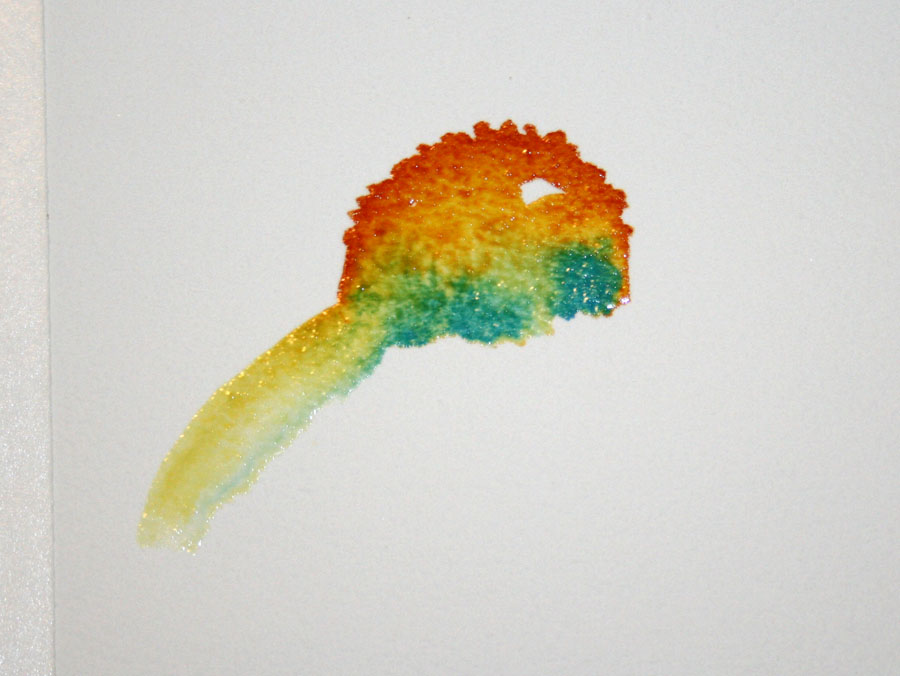
The sunflower painting you see in the top image began with a variegated wash of yellows with one of the pigments being yellow ochre (above left).  Some pigments have a grainy texture, and with the addition of salt, will create large patterns of moved pigment, depending upon the wetness of the area. Even though I love that feathered area created by the salt, as I was beginning to paint more detail in the sunflower, I decided the painting was much to busy. I concluded that the light salted area competed with the main subject, the sunflower and butterfly. Now, I'm not so sure. This would have been a good time to pause and wait.  But I didn't.  I continued, adding color in some areas and lifting color in others.

Below, is the part of the painting I like the most, largely because it's fresh and clean, and I like the colors.  Cropped a little differently, it could make a small painting on its own.
And below, you see the area I like the least, the area I couldn't leave alone.  My primary reason for disliking it, is that I was indecisive while working on it.  I added blue to the salted whites, changed purple shadows to blue, and then had some indecision about the colors used around the edges of the sunflower petals. If I tuck it away for a while, gain more distance from the experience, and look at it again later, my attitude toward it may change.
Sunflowers are fun to paint and there are any variety of ways to paint them.  Plus, they are abstract in shape, and reflect many different colors in those withering petals--purple, magenta, burnt sienna, brown, violet.  Because of these qualities, clear, dynamic colors and the sparkle of light are the elements that provide the most excitement.  I haven't tossed this painting, but I will try another one, hoping that all I learned from this one will coming tumbling out onto the paper in the next.

Not every painting we begin makes a great painting, but there is plenty to value in the experience of painting itself.  Every time I paint, I learn, gain confidence, get to know the pigments and how they interact with water and paper, and enjoy all the surprise discoveries that make watercolor such an exciting medium.

Links and Resources:
My first sunflower study can be found here:  Sunflower Study  
For more posts on practice and confidence visit:  The Illusive Nature of Confidence and Kindergarten Efforts.
For a discussion on scrubbing or lifting paint, visit:  Sketching a Limpkin

Thursday, September 8, 2011

Hummingbird Studies--Movement and Light

I will just about come up with any excuse to sit outside with hummingbirds this time of year.  Since tropical storm Lee has pushed rain and colder air our way in Tennessee, there has been an increased mob of hummingbirds gathered around my five feeders. They are especially active in the early morning and late evenings, just before departing to continue their migration as night migrants.  
Yesterday evening, while refilling a couple of feeders, I marveled as all feeders were occupied with 3-4 hummers at a time.  No sooner did they finish their drink, than they were back to fanning tails, chirping and giving chase.  Hummingbirds in flight are not easy to see for more than a few seconds, let alone, sketch, so I rely on my camera to give me details about posture and plumage.  

Even using my camera (Canon Rebel xi with 300 mm zoom lens) is a delightful challenge.  It requires patience, anticipation and steady nerves.  But what it also gives me is a closer view.  My current binoculars will not focus within the shorter distances needed for sketching, so my camera serves as a substitute, and occasionally gives me a nice in-flight reference image.  
Right now I am delighting in watching hummingbird behavior.  Mature birds and juveniles behave very differently.  When trying to capture these birds in a sketch, it is also a challenge to try to capture the light and movement which is so much a part of the personality of hummers.  So after hours of watching them, I enjoy trying to capture what I've internalized in a sketch.  This is resulting in a series of hummingbird studies. I could also label them studies of movement and light.

I am sure that each study will continue to look very different, as these two do.  These are playful experiments.  My challenge is to not 'mess' with what's happening on the page, but let the water and pigment move freely.  While painting, I'm focusing on the experience of hummingbirds, rather than the detail of the bird.  That's my goal, at least. Those beautiful details are hard to resist!
Bloom or watermark created by dropping clear water into pigment on paper.

A different watermark created by dropping clear water into an area that has been salted.


Monday, September 5, 2011

August Demonstration--Wet-in-Wet Coneflowers

I was delighted when I received a comment from Cora, after my post, Coneflowers--Wet-in-Wet and the Colors of White.  In her comment she told me she had practiced painting white coneflowers using the August demonstration example and posted them on her blog.
Below you see the example that she liked best, her first try.   I think it is my favorite too, because of that nice variation in the center where she dropped color into color, and the lovely whites that resulted.    
Seeing her blog post excited me for several reasons. First of all, she tried my practice example and shared it, and that was fun.  Secondly, when I read her profile description, I discovered that she is a newly practicing artist in the Netherlands, and she intends to post her efforts no matter what the results. Wow, I thought.  That takes courage--the courage to create your own stage and build a community for practicing art.  I know from my own experience, that every effort will not only strengthen her skills, but each time she posts her work, her art practice will benefit in boldness.  One of the many pleasures of blogging today is that we have a ready-made community of individuals who are also learning, practicing, enjoying creating art and sharing it.  It's a great opportunity for both motivating and encouraging our art practice.  .  

Because I haven't had an art class vacation in the past two years--that is, leaving town for a week and doing little else but painting watercolor--seeing Cora's practice examples also reminded me of one of the fun moments in art class that I've missed lately, the sharing time when everyone shows their efforts after a work session.  These were moments of enjoyment and satisfaction for me.  I always marveled at how beautiful everyone's work was, the uniqueness of each person's style, and easily found something to admire in each person's efforts.     
A coneflower sketch I created in 2000.    

This reminds me to say to you what I often have to say to myself.  When you are looking at your finished work and don't find yourself totally loving it, focus in on an area of the painting that attracts you, that you particularly like and notice why it appeals to you.  Then find the area that doesn't appeal to you and decide what you don't like about it.  Think about what you would like to see happening differently there. Remember that the special value in those 'dislike' areas is the learning that took place while you were creating it.
And all this information will be available to you the next time you paint!

August demonstration:  Wet-in-Wet and the Colors of White
Another post on the value of practice, Practice is the Magic of Talent.

Tuesday, August 30, 2011

Eastern Screech Owl--The Finish

Sometimes art work gets finished in an orderly fashion.  You move through the work from start to finish in a steady progression.  At other times, the project gets set aside for many different reasons, mostly a shortage of time, interruptions, something else inspiring happens, or an indecision may stall the finish.
In the case of this owl, it was a persistent indecision about those eyes.  When you wake a sleeping screech owl, they don't have a very happy expression on their face. This owl was roosting in a screech owl nest box, sleeping as owls do during the day in late November of 2009.  The opportunity to see him up close was so special.  There was only time for some quick reference photos, and the one I used for this sketch page was taken in overcast conditions.  No light reflected in those eyes, making that beautiful face even more menacing than it naturally would be under these circumstances.  So when I initially painted the sketch page, I painted the dark pupils reflecting no light, as in the photo.  As you can see, this does not result in an appealing expression.  Light brings life into our wildlife sketches.
I was surprised when I saw how long ago I first created this sketch.  I had finished the right side of the face, leaving the left unfinished and the dark eyes scrubbed out.   Yesterday, when I came across this unfinished sketch, I was again struck by the beauty of this magnificent little bird, our only small eastern owl with ear tufts (feathers). Screech owls are only about 7-10" in height and are both predators (omnivores) and prey for larger owls and hawks.

While visiting this sketchbook, I looked at more pages.  Many were finished, giving me a feeling of deep satisfaction and pleasant memories of the moments they captured. Others were left blank with a note about what I wanted to paint in that space, and still others had a pencil sketch. Any of your sketchbooks look like this?
Above, you see a delightful moment in a cold November rain when a tufted titmouse was singing his heart out just beyond my patio in the midst of red holly berries.  I look forward to finishing this page soon.

Owls are among the most beautiful of birds, with very intricate feathering patterns around their face forming the facial disk that is characteristic of all owls.  The facial disk is composed of stiff, lacy feathers that serve to direct air flow and aid vision and hearing.  But beyond function these feathers are exquisitely beautiful!  The feather tufts that we often call "ears" help camouflage the owl while it sleeps during the day.
Eastern screech owls come in two colors, the rufous or red phase you see here and a gray phase.


Saturday, August 27, 2011

Coneflowers--Wet-in-Wet and the Colors of White

Though it is late in the growing season, I had the urge to plant flowers this past week. It could have been because I ran across some of my favorite perennials that I couldn't find earlier in the season--coreopsis and coneflowers.
Besides the insects and birds that flowers attract, they are beautiful and fun to paint! Yesterday, I enjoyed an opportunity to sit near these garden additions and create coneflowers in my sketchbook using brush and paint without the detail of drawing. Coneflowers have a distinctive shape with daisy-like petals that loosely droop. How deeply the petals droop depends on the stage of the flower's maturity.  This characteristic makes them good subjects for loose painting.  By that, I mean watery painting with less concern about detail.
Besides planting purple coneflowers, I also planted a white coneflower variety.  The white in flowers is particularly fun to paint.  "White" in a watercolor painting is the lightest color/value in your painting.  Since white flower petals generally reflect the colors around them, they offer a fun opportunity to play with wet-in-wet painting, letting the colors blend on the paper and a brush stroke of clean water carry pale pigment into petal shapes.  I'll show you what I mean.
Below, you see how I created the watery flower images you see on the right hand side of the sketchbook at the top of this post.  If you would like to give this way of creating coneflowers a try, use one of the images above, or a flower from your own garden or collection of images as a guide.  If you already have experience with this type of painting, this exercise makes a fun and relaxing practice.

On dry paper, paint a coneflower head shape, as shown below.  I used WN Quinacridone gold.
Have two containers of water handy, one to rinse your brush between colors, the other to load your brush with clean water.  Brush clean water along the edge of the painted area and bring it down to form the shape of the flower head, as shown below.  Leaving white areas is one way to add interest and give the impression of light reflection. Learning how much water your brush holds and how much you need to use comes with practice.
While this area is still wet, drop in some cerulean blue (or another blue of your choice) along the bottom edge.
Rinse your brush and load it with clean water.  Touching the edge of the bottom of the cone shape, paint a petal shape with clear water coming down from the cone center. Pigment will flow into the water left by the brush stroke.  Tilt your paper if needed to aid this movement.
Continue to create petal shapes with brush strokes of water.  I enjoy the surprise of this technique and the richness of the color that is created when pigment is dropped into pigment.  The cerulean blue and quinacridone gold blend to create a nice green like the underlying color seen at the base of the yellow and orange blossoms of the coneflower head.
In the next study, I dropped in WN French ultramarine blue and a touch of Daniel Smith Alizarin Crimson along the bottom edge.  
Below, you see the variation that resulted.
Try a series of these studies and enjoy seeing a variety of interpretations of these lovely flowers.  Try adding a stem and a leaf.  And if you try this exercise and post your results on your blog, send me a link.  If you would like, I can post the link here.  If you don't have your own blog, and would like to share your results here, send an image to me at:  viclcsw (at) aol (dot) com.  Below, you see more of my studies.
I've used a scrap sheet of watercolor paper (with a rejected painting on the other side) and divided it with artist tape to create six separate painting areas for these studies.

Coneflowers are part of the aster (asteraceae) family, along with sunflowers and, like sunflowers, have a flower head with many tiny blossoms.  This is clearly one of my favorite flower families!


Ocean Trail at Rancho Palos Verdes Preserve, California--2015

Ocean Trail at Rancho Palos Verdes Preserve, California--2015

Joshua Tree National Forest, California, with son Chad and daughter Thuan--2015

Joshua Tree National Forest, California, with son Chad and daughter Thuan--2015
Photo credit: Thuan Tram

Bird banding with Mark Armstrong at Seven Islands State Birding Park - 2014

Bird banding with Mark Armstrong at Seven Islands State Birding Park - 2014
Photo courtesy of Jody Stone

Birds Close-up

Birds Close-up
Photo courtesy of Karen Wilkenson

Enjoying Gray Jays in Churchill, Manitoba

Enjoying Gray Jays in Churchill, Manitoba
Photo courtesy of Blue Sky Expeditions

A dog sled experience with Blue Sky Expeditions, Churchill, MB--2014

A dog sled experience with Blue Sky Expeditions, Churchill, MB--2014
Photo courtesy of Blue Sky Expeditions

Churchill, Manitoba--2014

Churchill, Manitoba--2014
Photo courtesy of Blue Sky

2014 Hummingbird Festival

2014 Hummingbird Festival
Photo courtesy of Jody Stone

Smithsonian National Zoo with one of my Whooping Crane art banners and son, John--2014

Smithsonian National Zoo with one of my Whooping Crane art banners and son, John--2014

Muir Woods on the Dipsea Trail at Stinson Beach, California--2014

Muir Woods on the Dipsea Trail at Stinson Beach, California--2014
Photo courtesy of Wendy Pitts Reeves

Checking out the gulls at Stinson Beach--2014

Checking out the gulls at Stinson Beach--2014
Photo courtesy of Wendy Pitts Reeves

Discovery Hike in Denali National Park and Preserve, Alaska--2012

Discovery Hike in Denali National Park and Preserve, Alaska--2012
Photo courtesy of Ruth Carter
Related Posts with Thumbnails