Showing posts with label watercolor. Show all posts

Saturday, October 26, 2013

Fun with Fall Leaves

There is nothing like the palette that autumn brings to our senses, as leaves turn from shades of green to a wide array of yellows, gold, orange and red.
This spectacular display is due to the interplay of pigments found in leaves.  As temperatures drop, trees stop producing chlorophyll, the pigment responsible for the green color of leaves.  This enables the other color pigments to shine through.
Autumn leaves are varigated in color as this change takes place and that makes it fun to paint them!   Go for a walk and notice the leaves and how they are changing.  Ours have just started to change in east Tennessee because we've just had our first few near freezing nights.  Pick up a few leaves as you walk and bring them inside and let's paint!
Select a leaf and either trace around the edges with your pencil or draw it on a piece of watercolor paper.
Mix up juicy puddles of the colors that you see in your leaf.  In the leaf I selected, I see green, red and rust. To make my green, I mix up a generous puddle of DaVinci arylide yellow and another puddle of WN phthalo blue near it to mix my green.  The other colors are WN Alizarin Crimson and WN Burnt Sienna for my red and rust.
There are many ways to paint a leaf.  In this post, I show you one way.

I wet the surface of my leaf sketch with water and paint it with my lightest color--in my case it is green-- leaving some areas unpainted.  Since leaves are varied in how their pigments change in the fall, I am only using the leaf I found as a reference for ideas and am not concerned with the final result looking exactly the same as the leaf.
Next, I drop some red and rust into the tips of the leaf, letting the two colors blend as I do this.  The damp surface of the leaf carries the pigment into other areas also.
When the surface of the paper becomes too dry, I rinse my brush and re-wet the surface again with clear water so that the water can carry the pigment beyond where I am painting.  As the wet pigment overlaps the dried green areas, I have created a glaze that will dry and show the green underneath.
When the pigment touches a wet surface it spreads and mixes with the wet color beside it.  In the image above, the edge of my red pigment at the bottom left has stopped on the dry surface leaving a hard edge.
I want that edge to be soft or blend softly into the next color, so I wet my brush, blot it to remove excess water, and brush that edge with water to soften it.
These hard edges will appear whenever the surface has dried, stopping the flow of pigment.  Whenever this happens, wet your brush, blot the excess water on a sponge or paper towel, and brush across that edge while the paint is still wet so that the pigment spreads into the damp surface and ends in a softened edge. Another way to do this--when you notice the surface has dried, dampen it with clear water before applying the next brush of color.  This keeps the pigment spreading as you work.
In my finished leaf below, you can see that some of my edges are blended and some remained hard.  Play with this and see which way you like it best.  Experiment with the amount of water and pigment so see how the paint flows.  Experiment with wetting the surface first and then with painting on a dry surface and using your damp brush to spread the pigment afterward.    
Below I've added some dark spots (sepia mixed with burnt sienna) and some splatter.  Have fun with it!
Next:  Fun with Fall Leaves--Wet-in-Wet on Dry Paper

More posts on wet-in-wet
The science of color in fall leaves

Sunday, June 30, 2013

Peregrine Falcon Watercolor in Tennessee Conservationist Magazine

When I submit an article to the Tennessee Conservationist Magazine, published by the TN Dept. of Environment and Conservation, I never know which photos will actually go into the article.  I send a good selection and the editor makes the final decision. Whenever possible, I include a watercolor of the bird that is the subject of my article but it is not a given that it will be published.  I was delighted to see that my watercolor, "Peregine Falcon", was included in the article that spanned five pages, and that the article also  captured the cover headline!

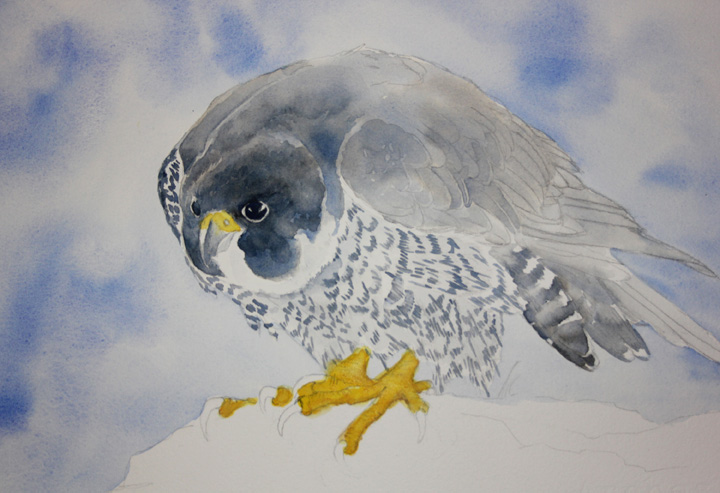
This watercolor began with a sketch that you see below, a practice to help wrap my mind around the shapes and expression that is characteristic of this incredible falcon. I had recently encountered a falconer showing this species on my trip to Alaska at the Sandhill Crane festival in Fairbanks, giving me a great opportunity to observe the bird up-close and take some reference photos.
The Peregrine Falcon's recovery in North America is one of the greatest conservation stories in our nation's history.  After the bird's devastating decline, largely due to the widespread use of DDT after WWII, the USFWS reported that there were only 324 confirmed pairs of breeding Peregrine Falcons nesting in all of North America.   
In Tennessee, breeding Peregrine Falcons had disappeared by 1947 and it wasn't until 50 years later that Peregrine Falcons were again discovered breeding in the state.

In the images below you can see how I approached this painting.  The sky was created by wetting the paper around the falcon and applying ultramarine blue to the wet paper leaving plenty of white for clouds.
As I often do, I put some detail in the face as I worked on the feather details.  I do this to make the subject come alive and add energy to the project while I work.  At other times, the additional detail gives me more of an idea of how the finished painting will look and helps guide my color application and lights and darks.  
Below, I begin to work on the rock surface where the Peregrine is perched.  I did not have a specific reference for the rocks but did look at rock treatments by other artists to give me some ideas.  I used warm colors to describe the boulder to balance the grays and blues in the bird.  For the boulder detail, I followed the lines of paint to shape a natural rock surface.
To finish, I added more definition and shadow to the feathers, sharper lines and individual definition to the rocks, and added some tufts of grass.  (See finished painting at top).  The Peregrine Falcon was one of the first species added to the endangered species list in 1973 and was finally removed in 1999.  In 2012, the USFWS reported that from 2000-3000 breeding pairs of Peregrine Falcons could be found in North America.

Links and Resources:
TN Conservationist Magazine--The Peregrine Falcon in Tennessee

Tuesday, October 25, 2011

The Sketchbook as a Map for Your Painting

A sketch is the artist's road map, like a tool for planning your journey.  Besides being its own form of art and a record of observations, turning to your sketchbook to work out decisions about your painting before you start can be invaluable.
Before I started my painting of this Northern Harrier, I had a number of decisions to make.  As soon as I received the request for this painting to honor a friend, I had a good idea of the posture I wanted the bird in for this painting, and I also had an idea of the way the background would look--open rolling fields common to east Tennessee. Decisions about color, values, and a landscape arrangement that would best highlight this bird were next.  To help, I turned to my sketchbook for color mixing and to make value studies.
Above left, you see a pencil sketch of the values, relative lights and darks for the landscape, and to the right another sketch of the same arrangement using watercolor. It was this little sketch to the right that gave me the first glimpse of the scene I had in mind.  I was still exploring colors at this point, deciding whether to use Payne's gray more prominently, or to remain with French Ultramarine, my favorite blue for mixing with Burnt Sienna to create neutrals.  You can see some of the neutrals possible in the first image above, along with a nice selection of autumn greens made with Quinacridone Gold and French Ultramarine.  Below, another series of color explorations with Payne's Grey on watercolor paper.
In the end, I settled on the colors that were the most pleasing to my eye and familiar to me, Winsor Newton's French Ultramarine, Burnt Sienna, Raw Sienna, Quinacridone Gold, and a touch of New Gamboge.  All other colors you see are made from this primary palette.
Unlike other hawks that hunt from a perch, the Northern Harrier hunts for small mammals gliding low over open fields to find its prey, aided by its acute hearing. Historically this species was especially impacted during the spraying of DDT in the 1970's. Northern Harriers have a unique and spectacular flight display called, 'sky dancing', involving high speed climbs, dives and spiraling loops to attract their mate. While the nesting of other hawks failed due to egg shells too thin to incubate, Northern harriers were so weakened by the pesticide that they could not carry out their elaborate courtship displays and breeding almost completely stopped. It took many years longer for this species to recover after the banning of DDT in this country.
Though considered stable or slightly declining currently, Northern Harriers are impacted by the loss of wetlands, prairies and changing farming practices.

11 x 14 watercolor on Arches 140# coldpress paper.

Links and resources:

To see the first post on this painting visit:  A Northern Harrier Hunting
More about the use of your sketchbook in creating a painting in:  The Richness of Watercolor
You may also enjoy visiting my Purple Martin painting, showing a different approach to painting a bird in its habitat.

Saturday, October 8, 2011

Part II--A Book, A Teacher, and Intuitive Learning

Have you ever wanted to do something so badly, that you were equally afraid you couldn't?  That pretty much sums up how I felt about becoming an artist.  And just to set that worry straight for any readers that feel something similar, if you love art and have always wanted to draw or paint, you already are an artist.  The becoming part is simply a matter of becoming familiar with the medium and developing skills through practice.  
Even though I was disheartened by my initial class, my interest in watercolor did not lessen.  I browsed the local art store for books and magazines to aid my attempts to paint.  It was during one of these visits that I found the treasure that shaped my art endeavors for the next ten years, a book called, Watercolor:  A New Beginning, by Ann K. Lindsay.
I opened the book while still in the store, as we often do, to leaf through it to see what it had to say.  I found topics like, "Being of Two Minds", describing the rational vs. the intuitive mind and how these two parts of our brain learn and approach things differently; "Managing Your Inner Critic" suggesting ways to manage your inner fear and why that critic develops inside; and, "Just in Case", addressing feelings of fear and resistance while trying demonstrations in the book.  Ann writes:  "Art is our heart coming right out of us onto the paper, into the world; no wonder we feel so vulnerable and easily discouraged".
This was the book and the instructor I had been looking for.  In the book, I found step-by-step instructions that actually started at the beginning with putting paint in the palette, suggesting inexpensive ways to get started.  Subsequent chapters demonstrated ways to play with pigment and water on paper, covered the basics on colors explaining primary, secondary, tertiary and neutral colors, and progressed to painting a subject using values with tips on drawing, and adding backgrounds to your paintings.
Exploring how different pigments react to salt.

This book, with its nurturing and encouraging approach, gave me the courage to feel excited about watercolor, again. So excited in fact, I traveled from east Tennessee to upper state New York the next summer, in 2000, to take what I consider to be my first watercolor class, this time with Ann Lindsay. This journey was an adventure and magnificent in so many ways. But most of all, I want to say a little more to you about that tenderness we feel as beginning artists, a feeling that can often hold us back.
Even in the gentle and nurturing environment of a class of true beginners with an intuitive and mindful instructor, my first attempt to put my art out into the world in that first day of class was truly frightening.

In my journal I wrote:
July 31st, 2000:  [Monday--day one] "I had a panic attack--throat closing, flushed, tears--over the show-and-tell thing we did after the first exercise today.  How could I be self-conscious, uneasy over splashing color and water on paper in no particular pattern? It is beyond my understanding sometimes, what sets off my anxiety."

August 4th: [Friday night, as the week of classes ended] "I have enjoyed this tremendously....Ann says, art is the soul coming out on paper. Maybe that's why this art is so very sensitive an issue for me. There aren't too many ways that I share my soul with others....When I shift to expressing who I am inside, talk about me, whether in a novel or a watercolor or sketch or photograph, that is a very sensitive moment. I feel vulnerable and exposed. Hence, my panic attack on the first day of class. It was less about what we were looking at, what I had created on paper, and more about how much I have always wanted to do this."

And to all of you artists out there--keep painting!

Links and Resources:

Part I to this post:  Books, A Difficult Start and A Passion for Watercolor

Monday, September 12, 2011

Sunflower Study II--A Fun Experiment

What do you do when you're feeling frustrated with something that's happening in the midst of your painting?  The best suggestion I have, stop right there and step back. Leave the painting alone for a few hours or a few days. Work on a different painting, or do something entirely different, and come back to it when you and your eyes are fresh again, and see what you think.  
This crossroad has happened to me many times.  Sometimes I succeed in walking away, other times I don't.  What is happening in that moment of frustration, at least one possibility--we are too "close" to the work, literally and emotionally.  Our left brain, with its specialty in technical skills, may have become too engaged in what it thinks "should" be happening, and is failing to let the painting create its own unique possibilities.

Below, you see, Sunlit Afternoon, a painting that I almost tossed in a moment of frustration.  This painting has been one of my favorites since I painted it five years ago.  Now, I would paint the adult whooping crane differently, showing more plumage details and shading, but I still love the interaction the painting expresses and its overall affect.  
In order to finish this painting, I had to set it aside for several days and come back to it.  I was having trouble with the water's edge, thinking it was too dark, and in the moment of frustration, not satisfied with any change I made.  Later when I came back to it, I found myself saying, now what was it I disliked so much?
The sunflower painting you see in the top image began with a variegated wash of yellows with one of the pigments being yellow ochre (above left).  Some pigments have a grainy texture, and with the addition of salt, will create large patterns of moved pigment, depending upon the wetness of the area. Even though I love that feathered area created by the salt, as I was beginning to paint more detail in the sunflower, I decided the painting was much to busy. I concluded that the light salted area competed with the main subject, the sunflower and butterfly. Now, I'm not so sure. This would have been a good time to pause and wait.  But I didn't.  I continued, adding color in some areas and lifting color in others.

Below, is the part of the painting I like the most, largely because it's fresh and clean, and I like the colors.  Cropped a little differently, it could make a small painting on its own.
And below, you see the area I like the least, the area I couldn't leave alone.  My primary reason for disliking it, is that I was indecisive while working on it.  I added blue to the salted whites, changed purple shadows to blue, and then had some indecision about the colors used around the edges of the sunflower petals. If I tuck it away for a while, gain more distance from the experience, and look at it again later, my attitude toward it may change.
Sunflowers are fun to paint and there are any variety of ways to paint them.  Plus, they are abstract in shape, and reflect many different colors in those withering petals--purple, magenta, burnt sienna, brown, violet.  Because of these qualities, clear, dynamic colors and the sparkle of light are the elements that provide the most excitement.  I haven't tossed this painting, but I will try another one, hoping that all I learned from this one will coming tumbling out onto the paper in the next.

Not every painting we begin makes a great painting, but there is plenty to value in the experience of painting itself.  Every time I paint, I learn, gain confidence, get to know the pigments and how they interact with water and paper, and enjoy all the surprise discoveries that make watercolor such an exciting medium.

Links and Resources:
My first sunflower study can be found here:  Sunflower Study  
For more posts on practice and confidence visit:  The Illusive Nature of Confidence and Kindergarten Efforts.
For a discussion on scrubbing or lifting paint, visit:  Sketching a Limpkin

Friday, June 17, 2011

The Richness of Watercolor--It's Interaction

11 x 14 watercolor, Monarch on White Crownbeard.
Watercolor is rich in it's versatility, in the many different ways you can approach a subject while attempting to capture the interplay of color and light. I suppose that is true with any medium, but watercolor moves as you paint and that quality gives it a richness and a freshness that is always full of surprises. I think it is this interaction, between the pigment and water, that always stirs in me the desire to explore it more. Each time I paint and see the results, I want to try again, see what other ways I can find to express what I'm seeing and feeling.
I painted this monarch primarily from a sketch in my sketchbook. While painting, I relied chiefly on the sketch rather than reference photos or having the subject in front of me. It is a different experience, a freeing experience. Sketches always feel lighter to me, free from the tension that painting a "real" painting sometimes causes.  It is wonderful practice and a wonderful way to keep your painting fresh.  There is a looseness in sketching that comes from the fact that you know it's practice, there's no pressure.  You're uptight left brain goes to sleep, after all, you can easily start over again.  And there is a practical limit to the amount of detail you can capture or even want in a sketch.  In fact, the lack of detail is the magic of a sketch.
Having said that, I love detail.  It is part of my fascination with nature and is one of the reasons I enjoy studying my subjects with my camera.  The camera brings the subject closer, allowing me to slow down the activity so I can learn more about what's happening.  And what I discover never fails to delight me.  But a painting is more than just a rendition of the subject in its environment.  A painting is also an interaction.  
This interaction is one of the most intriguing and challenging aspects of watercolor. There are the primary interactions that we are all familiar with, between pigment and water, paint and brush, and of course, between the visual reality and what the artist sees and feels. But there is also the important interaction the viewer has while viewing the art. When the viewer sees the final work, we, as artists, hope they will be inspired.
For me, the delight and inspiration of watercolor is stirred by that mysterious quality in its movement.  Using a photograph for reference, as I often do, can sometimes suck me into detail, which can result in a tight rendition rather than an image that is fluid. This is what I noticed as I worked on this painting.  The sketch freed me to just paint, to focus on what I found to be beautiful about the subject, to stay with the light and airy quality of both the butterfly and the flowers, leaving the details more to the imagination.
It is this stimulation of imagination that is the root of inspiration.  As creative beings, we love feeling this.  And when my painting is finished, it is this inspiration that I want others to feel right along with me.

Ocean Trail at Rancho Palos Verdes Preserve, California--2015

Ocean Trail at Rancho Palos Verdes Preserve, California--2015

Joshua Tree National Forest, California, with son Chad and daughter Thuan--2015

Joshua Tree National Forest, California, with son Chad and daughter Thuan--2015
Photo credit: Thuan Tram

Bird banding with Mark Armstrong at Seven Islands State Birding Park - 2014

Bird banding with Mark Armstrong at Seven Islands State Birding Park - 2014
Photo courtesy of Jody Stone

Birds Close-up

Birds Close-up
Photo courtesy of Karen Wilkenson

Enjoying Gray Jays in Churchill, Manitoba

Enjoying Gray Jays in Churchill, Manitoba
Photo courtesy of Blue Sky Expeditions

A dog sled experience with Blue Sky Expeditions, Churchill, MB--2014

A dog sled experience with Blue Sky Expeditions, Churchill, MB--2014
Photo courtesy of Blue Sky Expeditions

Churchill, Manitoba--2014

Churchill, Manitoba--2014
Photo courtesy of Blue Sky

2014 Hummingbird Festival

2014 Hummingbird Festival
Photo courtesy of Jody Stone

Smithsonian National Zoo with one of my Whooping Crane art banners and son, John--2014

Smithsonian National Zoo with one of my Whooping Crane art banners and son, John--2014

Muir Woods on the Dipsea Trail at Stinson Beach, California--2014

Muir Woods on the Dipsea Trail at Stinson Beach, California--2014
Photo courtesy of Wendy Pitts Reeves

Checking out the gulls at Stinson Beach--2014

Checking out the gulls at Stinson Beach--2014
Photo courtesy of Wendy Pitts Reeves

Discovery Hike in Denali National Park and Preserve, Alaska--2012

Discovery Hike in Denali National Park and Preserve, Alaska--2012
Photo courtesy of Ruth Carter
Related Posts with Thumbnails