Showing posts with label wet-in-wet. Show all posts

Thursday, November 7, 2013

Watercolor Leaf Explorations

In addition to this blog and my Vickie Henderson Art blog, I am honored to be a contributing member of Cathy Johnson's award-winning international group blog, Sketching in Nature.
Art and Photo credit:  Grace Cutmore

Grace of Grace and Simplicity left a comment on my blog post on fall leaves at Sketching in Nature and described how much she enjoyed her experience with the wet-on-wet painting of fall leaves.  She agreed to let me share her lovely leaf watercolors with you here!
Art and photo credit:  Grace Cutmore

One of my favorite times during art workshops with Ann K. Lindsay was the sharing time we had after working on a particular assignment to see all the different ways other artists in the class saw and interpreted their experience with watercolor.  We not only had the joy of viewing many artists' styles, but we shared what we enjoyed about our own experience, as well as, what we wanted to see happen differently.
Art and photo credit:  Grace Cutmore

Grace described her leaf painting as "fun and relaxing" as she watched the colors blend. Visit her lovely blog and her post about her leaf painting at Grace and Simplicity.

Next:  Layering leaves!  A preview example, below.
Links and Resources:

My Autumn Birds Note Cards

Fun with Fall Leaves series
Sketching in Nature
Sense and Simplicity
Ann K Lindsay
Autumn Birds painting progression
Why Leaves Change Color

Tuesday, October 29, 2013

Fun with Fall Leaves--Wet-in-Wet on Dry Paper

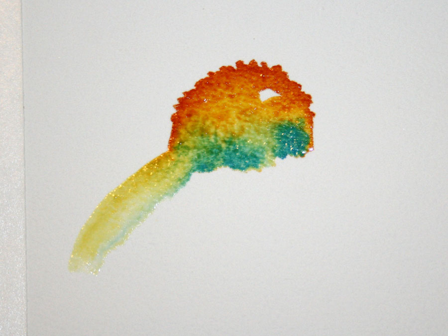
More fall leaves!  In this post, I am showing a different approach to creating a leaf painting without wetting the paper first (to see the first demonstration click here).  I begin painting on dry paper and use the wet pigment to carry the color and moisture.  
Where ever I stop the edge is wet.  I can continue that edge either by applying a brush stroke of water or by adding a brush stroke of a different pigment.  Where water is used, the paint will flow into the water diluting the color to give a lighter range of that color.  This provides highlights and variation.
If I brush another color along that edge, the colors will flow together at that point and give a blended appearance where they mix.  Red and yellow become orange.  Green and yellow become yellow-green, and so on.  Letting wet paint flow into wet paint creates brilliant colors as two primaries (red, yellow or blue) mix to form secondary colors.  In this painting, I am using Da Vinci arylide yellow, WN phthalo blue, WN alizarin crimson, and WN Burnt Sienna.
Below I have looked at my leaf for reference and decided to drop some green into that yellow area on the right (above) to create more yellow-green for that part of the leaf.
Compare the leaf below with the one above.  You can see how the green spread into the wet yellow paint and produced that nice section of green with yellow highlights.  I also added some burnt sienna around the edges.
As I looked at the painting above, I decided I wanted to see some red in that light middle section, so I wet it lightly with my brush.  Then I picked up some Alizarin Crimson in my brush and added it.
 This gave the pale area a hint of red in the middle and brightened it.
Next, I mixed some sepia with burnt sienna to add a dark leaf edge and some dark spots to the leaf.  To do this, I created a very wet mixture, loaded it into the brush, and tapped the brush with my finger to make some splatter on the leaf.
Try painting several different leaves or use the same leaf and paint it several different ways!  There are endless possibilities for enjoying leaves in watercolor!

Next:  Enjoying color movement

Saturday, October 26, 2013

Fun with Fall Leaves

There is nothing like the palette that autumn brings to our senses, as leaves turn from shades of green to a wide array of yellows, gold, orange and red.
This spectacular display is due to the interplay of pigments found in leaves.  As temperatures drop, trees stop producing chlorophyll, the pigment responsible for the green color of leaves.  This enables the other color pigments to shine through.
Autumn leaves are varigated in color as this change takes place and that makes it fun to paint them!   Go for a walk and notice the leaves and how they are changing.  Ours have just started to change in east Tennessee because we've just had our first few near freezing nights.  Pick up a few leaves as you walk and bring them inside and let's paint!
Select a leaf and either trace around the edges with your pencil or draw it on a piece of watercolor paper.
Mix up juicy puddles of the colors that you see in your leaf.  In the leaf I selected, I see green, red and rust. To make my green, I mix up a generous puddle of DaVinci arylide yellow and another puddle of WN phthalo blue near it to mix my green.  The other colors are WN Alizarin Crimson and WN Burnt Sienna for my red and rust.
There are many ways to paint a leaf.  In this post, I show you one way.

I wet the surface of my leaf sketch with water and paint it with my lightest color--in my case it is green-- leaving some areas unpainted.  Since leaves are varied in how their pigments change in the fall, I am only using the leaf I found as a reference for ideas and am not concerned with the final result looking exactly the same as the leaf.
Next, I drop some red and rust into the tips of the leaf, letting the two colors blend as I do this.  The damp surface of the leaf carries the pigment into other areas also.
When the surface of the paper becomes too dry, I rinse my brush and re-wet the surface again with clear water so that the water can carry the pigment beyond where I am painting.  As the wet pigment overlaps the dried green areas, I have created a glaze that will dry and show the green underneath.
When the pigment touches a wet surface it spreads and mixes with the wet color beside it.  In the image above, the edge of my red pigment at the bottom left has stopped on the dry surface leaving a hard edge.
I want that edge to be soft or blend softly into the next color, so I wet my brush, blot it to remove excess water, and brush that edge with water to soften it.
These hard edges will appear whenever the surface has dried, stopping the flow of pigment.  Whenever this happens, wet your brush, blot the excess water on a sponge or paper towel, and brush across that edge while the paint is still wet so that the pigment spreads into the damp surface and ends in a softened edge. Another way to do this--when you notice the surface has dried, dampen it with clear water before applying the next brush of color.  This keeps the pigment spreading as you work.
In my finished leaf below, you can see that some of my edges are blended and some remained hard.  Play with this and see which way you like it best.  Experiment with the amount of water and pigment so see how the paint flows.  Experiment with wetting the surface first and then with painting on a dry surface and using your damp brush to spread the pigment afterward.    
Below I've added some dark spots (sepia mixed with burnt sienna) and some splatter.  Have fun with it!
Next:  Fun with Fall Leaves--Wet-in-Wet on Dry Paper

More posts on wet-in-wet
The science of color in fall leaves

Sunday, January 29, 2012

The Yellow Glow Behind the Robin--Part II

At this point in my painting, my goal is to add more color to the lower leaves and background so they appear more connected.  In nature this naturally happens as light strikes the subject and surrounding colors are reflected in that light.  We seldom see all the edges of a leaf at a glance, for example.  We see enough to recognize the shape. Some areas will be sharp and clear, others will appear softened or fused with surrounding color and light.  
I chose to place the painting on a table easel for this application of wet-in-wet paint so that water and paint will coat the paper smoothly.  Setting the painting on an easel is one way to do this.  I also pick up the painting and change the angle to direct the flow of paint from time to time.  I use two large containers of water, allowing me to rinse the brush in one, and pick up clean water in the brush from the second.    This allows the paint to remain clear and bright when it mixes with the water in the brush.  
Above, I have wet the paper with my spray bottle and then applied brush strokes of New Gamboge, Quinacridone Gold and Perylene Maroon.  My spray bottle is actually an old hair spray pump bottle salvaged from years past when I used hair spray.  I prefer its fine mist.  As the paint mixture flows down the page, I am using a paper towel to collect the paint pooled on the edge of the tape.  If laid flat to dry, this excess paint and water will flow backward, leaving a washed out bloom. 
I have also tucked a rolled paper towel into the tray of the easel to catch the run off that occurs before I'm ready to wipe it.    
Above you see the additional color added to the lower left corner of the painting. Compare it to the pale color in the right hand corner.     
Above, I have placed a stroke of New Gamboge on the paper and diluted it by spraying it.  I follow this by adding more colors and allowing these to run together and blend on the paper.  You can see the change that occurs in the lower right hand corner below.    
Once this layer of color is dried, I can then paint the leaves and add more color to the surrounding background, a small area at a time as needed, leaving some leaf edges soft, some hard.  I can also add only a little defining color to part of a leaf, letting the rest of it blend with the background, or I can add a lot of detail as in the two larger leaves in front of the robin.   These variations add interest.   

When you are using a bright color in the background, such as the yellow that is used here, remember that you can alter it later with a glaze of another color.  As the painting progressed, I softened some of the yellow by adding a glaze of green (ultramarine mixed with arylide) to some areas, or a pale glaze of one of my reds to other areas.  
If you like color, variety, glazes, a chance to use wet-in-wet and create hard and soft edges, an "anything goes" approach to watercolor, fall leaves are a great subject to play with!

Part I of the Yellow Glow Behind the Robin
On this blog:  wet-in-wet demonstration

Monday, September 5, 2011

August Demonstration--Wet-in-Wet Coneflowers

I was delighted when I received a comment from Cora, after my post, Coneflowers--Wet-in-Wet and the Colors of White.  In her comment she told me she had practiced painting white coneflowers using the August demonstration example and posted them on her blog.
Below you see the example that she liked best, her first try.   I think it is my favorite too, because of that nice variation in the center where she dropped color into color, and the lovely whites that resulted.    
Seeing her blog post excited me for several reasons. First of all, she tried my practice example and shared it, and that was fun.  Secondly, when I read her profile description, I discovered that she is a newly practicing artist in the Netherlands, and she intends to post her efforts no matter what the results. Wow, I thought.  That takes courage--the courage to create your own stage and build a community for practicing art.  I know from my own experience, that every effort will not only strengthen her skills, but each time she posts her work, her art practice will benefit in boldness.  One of the many pleasures of blogging today is that we have a ready-made community of individuals who are also learning, practicing, enjoying creating art and sharing it.  It's a great opportunity for both motivating and encouraging our art practice.  .  

Because I haven't had an art class vacation in the past two years--that is, leaving town for a week and doing little else but painting watercolor--seeing Cora's practice examples also reminded me of one of the fun moments in art class that I've missed lately, the sharing time when everyone shows their efforts after a work session.  These were moments of enjoyment and satisfaction for me.  I always marveled at how beautiful everyone's work was, the uniqueness of each person's style, and easily found something to admire in each person's efforts.     
A coneflower sketch I created in 2000.    

This reminds me to say to you what I often have to say to myself.  When you are looking at your finished work and don't find yourself totally loving it, focus in on an area of the painting that attracts you, that you particularly like and notice why it appeals to you.  Then find the area that doesn't appeal to you and decide what you don't like about it.  Think about what you would like to see happening differently there. Remember that the special value in those 'dislike' areas is the learning that took place while you were creating it.
And all this information will be available to you the next time you paint!

August demonstration:  Wet-in-Wet and the Colors of White
Another post on the value of practice, Practice is the Magic of Talent.

Saturday, August 27, 2011

Coneflowers--Wet-in-Wet and the Colors of White

Though it is late in the growing season, I had the urge to plant flowers this past week. It could have been because I ran across some of my favorite perennials that I couldn't find earlier in the season--coreopsis and coneflowers.
Besides the insects and birds that flowers attract, they are beautiful and fun to paint! Yesterday, I enjoyed an opportunity to sit near these garden additions and create coneflowers in my sketchbook using brush and paint without the detail of drawing. Coneflowers have a distinctive shape with daisy-like petals that loosely droop. How deeply the petals droop depends on the stage of the flower's maturity.  This characteristic makes them good subjects for loose painting.  By that, I mean watery painting with less concern about detail.
Besides planting purple coneflowers, I also planted a white coneflower variety.  The white in flowers is particularly fun to paint.  "White" in a watercolor painting is the lightest color/value in your painting.  Since white flower petals generally reflect the colors around them, they offer a fun opportunity to play with wet-in-wet painting, letting the colors blend on the paper and a brush stroke of clean water carry pale pigment into petal shapes.  I'll show you what I mean.
Below, you see how I created the watery flower images you see on the right hand side of the sketchbook at the top of this post.  If you would like to give this way of creating coneflowers a try, use one of the images above, or a flower from your own garden or collection of images as a guide.  If you already have experience with this type of painting, this exercise makes a fun and relaxing practice.

On dry paper, paint a coneflower head shape, as shown below.  I used WN Quinacridone gold.
Have two containers of water handy, one to rinse your brush between colors, the other to load your brush with clean water.  Brush clean water along the edge of the painted area and bring it down to form the shape of the flower head, as shown below.  Leaving white areas is one way to add interest and give the impression of light reflection. Learning how much water your brush holds and how much you need to use comes with practice.
While this area is still wet, drop in some cerulean blue (or another blue of your choice) along the bottom edge.
Rinse your brush and load it with clean water.  Touching the edge of the bottom of the cone shape, paint a petal shape with clear water coming down from the cone center. Pigment will flow into the water left by the brush stroke.  Tilt your paper if needed to aid this movement.
Continue to create petal shapes with brush strokes of water.  I enjoy the surprise of this technique and the richness of the color that is created when pigment is dropped into pigment.  The cerulean blue and quinacridone gold blend to create a nice green like the underlying color seen at the base of the yellow and orange blossoms of the coneflower head.
In the next study, I dropped in WN French ultramarine blue and a touch of Daniel Smith Alizarin Crimson along the bottom edge.  
Below, you see the variation that resulted.
Try a series of these studies and enjoy seeing a variety of interpretations of these lovely flowers.  Try adding a stem and a leaf.  And if you try this exercise and post your results on your blog, send me a link.  If you would like, I can post the link here.  If you don't have your own blog, and would like to share your results here, send an image to me at:  viclcsw (at) aol (dot) com.  Below, you see more of my studies.
I've used a scrap sheet of watercolor paper (with a rejected painting on the other side) and divided it with artist tape to create six separate painting areas for these studies.

Coneflowers are part of the aster (asteraceae) family, along with sunflowers and, like sunflowers, have a flower head with many tiny blossoms.  This is clearly one of my favorite flower families!


Ocean Trail at Rancho Palos Verdes Preserve, California--2015

Ocean Trail at Rancho Palos Verdes Preserve, California--2015

Joshua Tree National Forest, California, with son Chad and daughter Thuan--2015

Joshua Tree National Forest, California, with son Chad and daughter Thuan--2015
Photo credit: Thuan Tram

Bird banding with Mark Armstrong at Seven Islands State Birding Park - 2014

Bird banding with Mark Armstrong at Seven Islands State Birding Park - 2014
Photo courtesy of Jody Stone

Birds Close-up

Birds Close-up
Photo courtesy of Karen Wilkenson

Enjoying Gray Jays in Churchill, Manitoba

Enjoying Gray Jays in Churchill, Manitoba
Photo courtesy of Blue Sky Expeditions

A dog sled experience with Blue Sky Expeditions, Churchill, MB--2014

A dog sled experience with Blue Sky Expeditions, Churchill, MB--2014
Photo courtesy of Blue Sky Expeditions

Churchill, Manitoba--2014

Churchill, Manitoba--2014
Photo courtesy of Blue Sky

2014 Hummingbird Festival

2014 Hummingbird Festival
Photo courtesy of Jody Stone

Smithsonian National Zoo with one of my Whooping Crane art banners and son, John--2014

Smithsonian National Zoo with one of my Whooping Crane art banners and son, John--2014

Muir Woods on the Dipsea Trail at Stinson Beach, California--2014

Muir Woods on the Dipsea Trail at Stinson Beach, California--2014
Photo courtesy of Wendy Pitts Reeves

Checking out the gulls at Stinson Beach--2014

Checking out the gulls at Stinson Beach--2014
Photo courtesy of Wendy Pitts Reeves

Discovery Hike in Denali National Park and Preserve, Alaska--2012

Discovery Hike in Denali National Park and Preserve, Alaska--2012
Photo courtesy of Ruth Carter
Related Posts with Thumbnails